Hello!
And as you might have guessed by the title, a mere nine months after I thought we'd be testing, we're testing. Actually we've been testing informally and discursively most of the month, amending and tweaking things (of which more later) but we've now started more formal testing.
My God, nine months though. It's bloody horrible to write it let alone have to read it as a patreon.
Although, I suppose, in my defence at least charging has been off all that time and six months of that delay absolutely wasn't my fault* Three months of it though has been, given I decided to implement a GUI re-design prompted by not being able to do anything in those six months really but think about the game.
Now I know it's an absolutely absurd statement to say that a major accident was a good thing.** But, having seen both the new GUI in action and the testers reactions to the whole thing then it might not have been entirely a bad thing. Certainly, it seems I've made the best out of a bad situation at least.
Because it is good. Very. Now I know it's damned easy for a dev to engage in hyperbole like that, especially when all you guys have seen is the odd still and poor quality video captures, but I trust the testers reactions and, given they're players first and foremost, their positive reception to it we should be able to take to the bank. The removal of the old front and back ends with the new immersive front and back ends seems to have been especially implemented well and although the tutorial is skip-able the general view appears to be that it's sufficiently seamlessly integrated that the player shouldn't. But I'll leave that one to you.
Alrighties, enough guff, to business.
Testing
I was hoping to get something out this month but, the whole point of playtesting is to ensure it meets the standards we're aiming for and isn't just a box we have to tick. Since the end of last month there have been a number of significant changes to the GUI design and without further waffle, let's go through them.
GUI the first - Mission reporting
This one was one of those "Oh bloody hell" moments in that I'd initially decided to just replace the old Becca's path chat with the new achievements system. Which seemed fine at the time and so I mentally ticked that off as done and moved on. But as the GUI design progressed, one of things I did was to hide the achievements unless the player actually wants to see them (After all they are mostly story spoilers) which meant that having them go "Ta-Dah!" at the end of the chapter didn't really work any more.
So instead we now have a little fade to black, a small whizzy animation and then a mission report screen showing the MC's orders and requests. So sort of like a quest log with the softer orders, i.e. say the pollen recovery mission being considered a request for this reports purposes. I also added buttons for the achievements as well here so you have the option of checking them if you so wish.

Finally, I've added an autosave function in when you close this screen. This means that you'll always have the perfect start point ready to go in between chapters. Of course you can still do all your own saves and loads but I thought this was a helpful tweak that you can ignore or use as you see fit.
GUI the second - The Morris database
Ah, the Morris database. I so loved this as a concept but the execution was not so great. The idea of having a system that, based on what you found would prompt you towards a solution or mislead you massively (if logically) was a neat one. But it didn't really work that well, plus it was another set of controls to get used to and design wise it was also pretty messy.
So not a success - and so it's gone. Sort of. It now lives in a much simplified form on the PDA itself and activating it gives you this screen instead of having a separate three stage set of icons and images.

The advantages here are several. Firstly, it's one click and you're done - the information is right there for you straight away. Secondly, and off the back of this, is that you can see quite clearly what you've chosen to do on each path and who did it. The MC or Mike. Finally, I can only see this re-design being a boon to those with multiple paths and saves.
It also means one less icon on the screen of course which just makes things cleaner. I made space for it on the PDA by moving books and comics to the MC's inventory system and they can now be access there with a single click.
GUI the third - Information panels
Now this is going to sound an odd one, but the information detail panels got re-worked from full screen to part screen, as below. So I did more work to give you less? Well sort of. The thing about the information panels is that, if a player uses them at all, they'll be used for information (Shock horror!) and, with something like weapons, it's primary use will be able to compare weapon types stat wise. Having them as full panels which you have to dismiss before opening the new one made comparisons very clunky and a bit of a chore. Far better, design wise, for the player to be able to just click up and down the list making comparisons so much easier.

GUI the fourth - The message system
Now, apart from the old message system looking awful, it was a very passive system. Really only existing as there are a few places in the story where it's needed as a plot point. Which, when you think of it, is not only immersion breaking but also a bit of a missed opportunity.
So....ta-dah.

Now it's not massively complex, having three core messages available for every NPC. But out of three I could pick these seemed the most useful defaults and should assist in finding and planning your days on Ophion. Want to know when and where someone will be free? Just ask them.
You'll note that there is space for more and depending on your relationship or mission status with the character additional options will become available. Their responses, as you'd expect from me, can vary wildly...
GUI the fifth - The hints system
It's gone. *Poof*. It was never terribly good in the first place, partly I suspect, as it went against my core writing style of "Show not Tell" and my heart was never really in it. Besides, you're too smart to require a system that pops up and tells you something you've just seen in text or via imagery.
Of course, it's made even more redundant now by the Achievements and Character Events screens. Instead I'm using the space that was planned for it on the NPC sheets to show NPC inventory and loadouts instead. Much more useful I feel.

So, as you can see, I haven't exactly been idle but there's still work to do. On the other hand we've cleared the design hurdles now**** and we're on solid ground progress wise. It's dull, tedious but pretty important work and the reactions from those that have used the new GUI does seem to validate the decision to have done it. I'll update again next week. Naturally, Patreon charging will remain off until Five is due to come out.
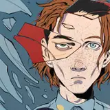
Oh, the header image at the top? I refreshed the Bored Pilot in Chapter One whilst I was at it. It was pretty bloody shabby compared to the later ones so and I needed a break from code and design so...why not? :)
Stay (or be) lucky.
Notty
* which should have course only have been three months. "Thank you NHS..." (yep, I'm still sodding annoyed about that. Sorry.)
** A friend helpfully did some maths which showed it was a damned closer shave than I'd realised at the time***. There was about a two seconds travel difference between me huffing, puffing and bitching about it today - and being deader than flares. It's possible I might have been underplaying the whole thing a little bit...
*** Apparently this was done to cheer me up. It sort of just freaked me out a bit really....
**** Design being it's own skillset of course which even big studios struggle with. I gather some quite major games require 16 clicks to even just start the bloody thing!
Adam Bengston
2023-01-29 19:31:07 +0000 UTC