pls help me choose a thumbnail for my new video
Added 2021-11-24 20:14:00 +0000 UTChi y'all!! i'm working on the thumbnail for my new video and i can't figure out how i wanna go about the lettering...pls vote for ur fave and comment to let me know what you think!
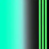
1)

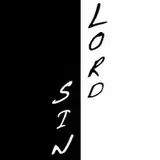
2)

i know the second one is a little harder to read, but i feel like it's still interesting? a bit different from other thumbnails of mine...i wonder how i might go about making it easier to read..maybe i should just outline the letters instead of doing a shadow..HRM gimme ur thoughts!
Comments
I would mix the two of them, the pink background with the typography of the second one. it will make it better to read and I think will make a lovely contrast
Ellie
2021-11-25 15:56:50 +0000 UTCPersonally, I think it's difficult to read the text on both because there isn't enough value contrast. The first one could benefit from the pink shape being bigger to provide contrast for more of the top and bottom part of the letters. It could also be a little darker. The second one would be better if the light yellow part of the text was a medium or dark value (maybe a blue to match the color palette). Love the photo though!
Grace Benedick
2021-11-24 22:27:46 +0000 UTCI might be a weird outlier, but the second one is easier for me to read because the letters stand apart from the background, where the pink connecting line in the first one blends it together. Lol I dunno if that makes sense? Either way, I'm excited for the new vid C:
miggyfool
2021-11-24 20:48:54 +0000 UTCYeah I definitely think the second one is harder to read, but I prefer it! Maybe combining them with a pink line in the back? Behind the words
Cori Foster
2021-11-24 20:48:45 +0000 UTCi feel like the solid line kinda takes away from the fun dynamic of the lettering, so i might save it for a thumbnail that has a large blank negative space!
cheyenne 🌠
2021-11-24 20:25:14 +0000 UTCI love them both, but you're right, the 2nd is much harder to read, so I have to go with choice #1! I love the idea of #2, I bet it would be easier to read if you did a solid wavy line behind if like you did for #1
Kelsey Camacho
2021-11-24 20:23:17 +0000 UTCBoth are hard for me to read but I like the second way more! Perhaps you could give it a thin outline?
TeslaDarwin
2021-11-24 20:22:59 +0000 UTCThe second one is so cool but you are defo right that it’s hard to read…maybe save it for a thumbnail where there’s a big blank spot in the picture?
Zola
2021-11-24 20:22:31 +0000 UTC