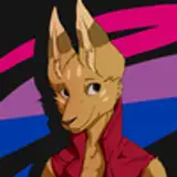
Hi friends!! I'm in the midst of designing the icons for the $2 tier reward for this month, but I'm a bit stuck...this is my first time designing icons like this, and I can't decide if I want to do thicker black outlines for a more traditional "icon" look?? if that makes any sense, I'm thinking of the item icons from Paper Mario 2 as a specific inspiration point!! i mean look how well done these are:

So, I'm debating between the thicker black outline, or going with a colored outline...or maybe I should combine the two where the outer line is black, but any interior linework is colored. HRM please let me know what you think !!
Sarah Chilby
2021-03-23 00:16:27 +0000 UTCcheyenne 🌠
2021-03-11 00:51:25 +0000 UTCLuna Robinson
2021-03-11 00:42:27 +0000 UTCJavi Infante
2021-03-10 23:57:47 +0000 UTCEliza
2021-03-10 21:52:43 +0000 UTCB Grace
2021-03-10 21:32:43 +0000 UTCB Grace
2021-03-10 21:32:28 +0000 UTCRoisin Kierstead
2021-03-10 21:28:24 +0000 UTCElizabeth Aman
2021-03-10 20:55:08 +0000 UTCIona M Jones
2021-03-10 20:54:46 +0000 UTCtiara rene
2021-03-10 20:54:04 +0000 UTCGrace Martin
2021-03-10 20:31:19 +0000 UTCEscalera Díaz Regina
2021-03-10 20:27:10 +0000 UTCCeleste Marie
2021-03-10 20:23:24 +0000 UTCNicole Josephine
2021-03-10 20:21:26 +0000 UTCJoan Zheng
2021-03-10 20:20:35 +0000 UTCAmy Peel
2021-03-10 20:20:07 +0000 UTCKaela See
2021-03-10 20:19:06 +0000 UTCSydney Kim
2021-03-10 20:18:37 +0000 UTCKailyn Knight
2021-03-10 20:16:40 +0000 UTCDaria
2021-03-10 20:16:10 +0000 UTCAllison Crowell
2021-03-10 20:15:41 +0000 UTCBourdet Emilie
2021-03-10 20:15:26 +0000 UTCJulie Birge
2021-03-10 20:14:53 +0000 UTCBex Nissen
2021-03-10 20:14:14 +0000 UTCanna bee
2021-03-10 20:12:45 +0000 UTCTacoroach
2021-03-10 20:12:23 +0000 UTCLili
2021-03-10 20:12:14 +0000 UTCSam Urena
2021-03-10 20:11:03 +0000 UTCPorter
2021-03-10 20:10:54 +0000 UTCRoseann Rosillo
2021-03-10 20:10:33 +0000 UTCVictoria
2021-03-10 20:10:28 +0000 UTCMarlee
2021-03-10 20:10:25 +0000 UTCAnahi Florez
2021-03-10 20:10:13 +0000 UTCghoulboss
2021-03-10 20:10:09 +0000 UTCEmma Sewell
2021-03-10 20:10:06 +0000 UTCOJ
2021-03-10 20:10:05 +0000 UTCCata Mari
2021-03-10 20:09:56 +0000 UTCEileen Morley
2021-03-10 20:09:45 +0000 UTCAshley Itliong
2021-03-10 20:09:37 +0000 UTCMaría Castrillón
2021-03-10 20:09:30 +0000 UTCNubia Gonzalez
2021-03-10 20:09:28 +0000 UTCMegan Beretta
2021-03-10 20:09:27 +0000 UTCBucky
2021-03-10 20:09:23 +0000 UTCtrisha hartley
2021-03-10 20:09:23 +0000 UTCFinlay
2021-03-10 20:09:22 +0000 UTCCass
2021-03-10 20:09:22 +0000 UTCclaire ʕ·ᴥ·ʔ
2021-03-10 20:09:19 +0000 UTCCathryn Caldarola
2021-03-10 20:09:14 +0000 UTCJosi
2021-03-10 20:09:12 +0000 UTCMariah Bolda
2021-03-10 20:09:06 +0000 UTCMahiah
2021-03-10 20:08:55 +0000 UTCappleswithstars
2021-03-10 20:08:50 +0000 UTCRZD
2021-03-10 20:08:31 +0000 UTCNatalie Beltowski
2021-03-10 20:08:27 +0000 UTC