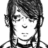
update 2: i caved and ordered a normal, an inverse, and a normal one without a border so now i got OPTIONS
update: i think i fixed the images now!! hopefully you can see both of em x
hey friends!!! i’m currently designing an ink stamp - i wanted something i could put on a wide array of things, from bags to cards to packaging, so i figures it was time to rethink my logo. i really like this little gnome lass, so i decided to incorporate her a bit more into my branding! she’s simple, easy to draw, but i think also a signifier of the style of work i make. only problem is, i can’t decide if i want the normal or inverse version for my stamp! what do y’all think would look better? imagine it stamped on sticker order bags, cards, packaging, and lemme know what you think!!


nyia
2020-02-28 15:49:13 +0000 UTCJayme Tucker
2020-01-29 07:09:16 +0000 UTCMarlee
2020-01-21 21:29:17 +0000 UTCLaurel Petrik
2020-01-21 21:19:27 +0000 UTCMandi Farrell
2020-01-21 20:23:27 +0000 UTCtsymonevisuals
2020-01-21 18:12:17 +0000 UTCthebeesknees.jpg
2020-01-21 16:09:22 +0000 UTCcheyenne 🌠
2020-01-21 09:39:56 +0000 UTCJulie Flestado
2020-01-21 09:38:55 +0000 UTCJenny
2020-01-21 08:46:29 +0000 UTCnina
2020-01-21 08:32:09 +0000 UTCSonja
2020-01-21 07:09:49 +0000 UTCIween
2020-01-21 05:14:21 +0000 UTCKailie Michalak
2020-01-21 03:39:54 +0000 UTCCHRISTOPHER BARTON
2020-01-21 03:02:50 +0000 UTClucy
2020-01-21 01:33:03 +0000 UTCAlicia O
2020-01-21 00:48:00 +0000 UTC@_AnnaVenture_
2020-01-21 00:15:55 +0000 UTCMelissa guy
2020-01-21 00:02:47 +0000 UTCMaddy Young
2020-01-20 23:34:35 +0000 UTCAmy Heazle
2020-01-20 23:29:28 +0000 UTCindia jane
2020-01-20 23:18:06 +0000 UTCPosie Sheriko
2020-01-20 23:05:53 +0000 UTCAllison Worth
2020-01-20 23:02:32 +0000 UTCDanielle Bennett
2020-01-20 23:01:32 +0000 UTCEvie Scotia
2020-01-20 22:59:27 +0000 UTCEvelin Graupe
2020-01-20 22:58:31 +0000 UTCWeika
2020-01-20 22:53:08 +0000 UTCYulia
2020-01-20 22:53:02 +0000 UTCSharon Hollenbach
2020-01-20 22:52:13 +0000 UTCKelly Wallis
2020-01-20 22:51:09 +0000 UTCcheyenne 🌠
2020-01-20 22:50:21 +0000 UTCBrennaBeloved
2020-01-20 22:50:00 +0000 UTCMichala Henderson
2020-01-20 22:48:01 +0000 UTCNatalie Whitmore
2020-01-20 22:47:41 +0000 UTCSharon Hollenbach
2020-01-20 21:23:53 +0000 UTCEmily Clark
2020-01-20 20:48:40 +0000 UTCcheyenne 🌠
2020-01-20 20:43:14 +0000 UTCWeika
2020-01-20 20:41:58 +0000 UTCDanielle Bennett
2020-01-20 20:41:01 +0000 UTCsaki
2020-01-20 20:31:15 +0000 UTCRosie Rodriguez
2020-01-20 20:30:21 +0000 UTCOJ
2020-01-20 20:30:04 +0000 UTC