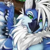
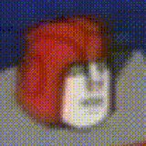
Zeta - Subtle re-design
Added 2018-08-05 04:22:23 +0000 UTC
I like Zeta, but despite the numerous already completed sketches and other art of her existing design, I have for a while been less than 100% satisfied with her look. Maybe 80%. So I took the chance to fiddle with some things. Largely she's still the same, but I've made note of the changes on the image here, as well as her outfit to a slight degree: making it look more like ARA and Warning's to give some semblance of a uniform between them.
Cleaned up her markings to be less busy. Simplified Some shapes. Got rid of the gradient in her hair.
The biggest change is the addition of horns. She's a 'kleyka', same custom species as Radoslav, which I always viewed as something of a chimera: lizard parts, fox parts, horns, appearing/disappearing markings.. I didn't originally have a reason for opting off of the horns on her. After doing some search into female species with horns, and considering the design implications, I think they're rather fitting. I don't have any horned girls, and swapping out some different shapes, I liked the appearance of these, had a commanding appearance, something Kaltag probably would have shot for in designing a Second-in-Command AI.


Those horns are totally used for long range communication. Perhaps glowing blue tips.
Alexander79
2018-08-07 15:58:41 +0000 UTC
Hmmm.. smaller chest size I'm alright with, though she didn't really look big to begin with, but I agree, she looks kind of.. thin and frail for a "mother" AI. I do like the horns, I like the markings..the tail is better now, just ..not sure about how ..thin she is.
Spartan277
2018-08-07 03:51:56 +0000 UTC
Good points and feedback! Noted for when I get back around to her
FluffKevlar
2018-08-06 20:39:01 +0000 UTC
While I think the general shift gives her more character, I'm not a fan of how thin she is from the waist up. I don't mean breast size, but how she looks like she has almost no muscle and might snap if a strong gust of wind comes along. Before she had a bit more shoulder width and muscle shape that I liked. Her upper half also seems slightly disproportionate to her slightly more muscular and very long legs, a bit like widowmaker.
Tela
2018-08-05 21:44:57 +0000 UTC
Am I seeing things, or did one of those eyes blink? Is that secretly a gif you uploaded there?
Latency
2018-08-05 20:20:08 +0000 UTC
i also think the alternate horns look better
SwiftKitten
2018-08-05 15:34:30 +0000 UTC
The horns are indeed a nice touch and I think I like the alternative ones more. I generally love how lithe she is and I look forward to seeing any additional changes you make.
2018-08-05 14:54:31 +0000 UTC
Honestly Fluff, I'm not crazy about the horns. I like everything else about the figure of Zeta atm but the horns just seem a little tacked on imo.
Tevin Escobar
2018-08-05 14:47:03 +0000 UTC
I like her design update and think it makes her look more sleek and elegant. I also like the alternate horns more than the initial set.
Rox79
2018-08-05 12:37:16 +0000 UTC
I really don't like the pointy horns. It just looks rather iffy on her imo. The alternative horns looked much better as they don't overtake her head and make her look busy. As for the other minor details, I like the markings, tongue, eyes, BUT I just wish that her thighs were just bit more thicc like her old design originally was. It just gives her a nice gap overall and makes her look more hot to me.
2018-08-05 12:16:02 +0000 UTC
I have a similar sentiment on the breast size, and it's always nice to see feminine figures that aren't heavy on the bust. (Not that exaggerated proportions are a problem with you.)
I do get less of a motherly vibe though. I think that has to do with the extra height and slimming. I get more of a sultry supermodel feeling enhanced by the expression. Might be fine for the more commanding times though.
Cult of Dust
2018-08-05 11:39:03 +0000 UTC
I'd think the second style of horns is more fitting for a second-in-command calm personality. The first are much more dominant and aggressive. Also, the second will fit through doorways easier.
Cult of Dust
2018-08-05 11:31:35 +0000 UTC
I like the first set of horns. I feel like the second set get lost in her ears a little. But I'll love the character no matter what you do to them! They are one of my favorites! Keep up the awesome stuff
2018-08-05 10:37:17 +0000 UTC
Well nothing's 100% stone final, I always like hearing feedback during concept art or redesigns. Thanks!
FluffKevlar
2018-08-05 07:53:28 +0000 UTC
I like the horns and the overall changes, would have kept the breasts the same personally, but it's up to your preference of course
Commodore Cougar
2018-08-05 07:14:05 +0000 UTC
Redesign looks great, though I think the alt horns fit her a lot better.
Ehtwoo
2018-08-05 07:11:26 +0000 UTC
I love this new design, and personally I think adding horns to her is a nice touch. Definitely gives you more variety with your female characters, since as you said yourself, you don't have any girls with horns.
Xargoth
2018-08-05 06:32:36 +0000 UTC
I really like the new look, she’s always has been a favorite OC’s of your. I think the alternative horns that point back are a better fit for her.
Fallout LEO
2018-08-05 06:31:44 +0000 UTC
I actually really like the "revamp". It was a little hard to tell she was meant to resemble the same species as Kovsai before, but this makes it way more noticeable. The horns will take some getting used to, but I don't think they look terribly out of place.
Volpethrope
2018-08-05 06:21:57 +0000 UTC
I know, I love the fact that you look for feedback, that is important, that's why we love you
RougeNation
2018-08-05 06:09:28 +0000 UTC
Ive edited the post to see if another one of the finalists looks better. Thoughts?
FluffKevlar
2018-08-05 06:02:31 +0000 UTC
I don't see why you'd get roasted. It's perfectly fine to disagree or dislike design elements. I like the feedback. Ive edited the post to see if another one of the horn designs looks better.
FluffKevlar
2018-08-05 06:01:33 +0000 UTC
Yes, lol. I didn't just go with the first thing I drew on. But as with most designs, I'll just have to wait and see how I feel about em.
FluffKevlar
2018-08-05 05:53:06 +0000 UTC
Some nice changes but I'm not really a fan of the horns, just my preference. maybe if they were a little more subtle than so in your face, they kind of remind me of minotaur horns which I guess could lead into the whole chimera aspect. Did you look at any other designs of horns before you picked these?
CHRISTOPHER MICHAEL BOYLE
2018-08-05 05:17:55 +0000 UTC
Nah, I dont like the horns, however I'm not sure of the species, but it doesn't look right on the females, I'll probably get roasted for this...Lol
RougeNation
2018-08-05 05:14:40 +0000 UTC
I think it was just too much visual stuff going on. and yeah the horns are a different addition that may take some adjustment, haha
FluffKevlar
2018-08-05 05:10:28 +0000 UTC
I think it was just too much visual information/too many colours in and around the head area. I think this gives a slightly better balance.
FluffKevlar
2018-08-05 05:01:17 +0000 UTC
I really love that outfit. Especially the footwear!
CobaltTiger
2018-08-05 04:51:08 +0000 UTC
Oooh that tongue~
I always really liked this race design, it's like a bunch of cool interesting traits put together. I think this change is an upgrade, simple is best.
unsteddy
2018-08-05 04:39:58 +0000 UTC
I'll miss the hair gradient. :c Not too sold on the horns, but it's probably just because I'm not used to seeing them on her.
Silvador
2018-08-05 04:38:24 +0000 UTC
Hate to see the hair gradient go, but it's probably a lot easier draw
Kaizer
2018-08-05 04:33:25 +0000 UTC
Zeta has always been a favorite of mine from you! I just really enjoy her overall design and personality from what you've shown of her. I enjoyed her old design for sure, but I really like the direction you took with her redesign. I know a while back (on a request stream I think) the talk of giving her horns came up and I'm so glad you got around to trying them out with her, them came out really nice and fit her well! I am surprised that you got rid of the gradient in her hair, though. It was a simple attribute, but one I enjoyed on her. All in all, her new design looks fantastic and I can't wait to see what you have in store for her in the future!
C-Fed
2018-08-05 04:32:53 +0000 UTC
Oh very nice. I think she looks a lot better with horns!
Kenith Fox
2018-08-05 04:30:30 +0000 UTC
She looks great, also i like the new details and designs for her.
Antoine Davis
2018-08-05 04:26:23 +0000 UTC