XaiJu
Rifleman
Rifleman

patreon


C#21

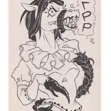
Still can't get a grip with Old Postcard-ish design. What a shame.


I don't even know how this looks to people. maybe you could comment on that.

Should I rework with overall layout design? If you think so. maybe some suggestion or style you'd like to see? Im open with any suggestion.


Thank you all for being patreon again.

C#21 C#21

Comments

Two things I took away from briefly looking at a Google search for "1940s postcards" was that there's a block letter font that seems to be popular, but more importantly to you, it seem to be pretty common for any pictured setting to be framed from a low angle. I think the low angle sort of makes everything feel bigger or larger than life. Otherwise, your composition is pretty reminiscent of other examples I saw.

SkyrimL33T

It looks great to me! It's what I expect from this style. Keep in mind I'm not an artist though. I'm unlikely to be able to tell

Brett E


More Creators