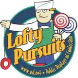
I know this is not candy related but the projects I'm doing right now are store front related. You saw a previous draft of this. I cleaned up the text, bent the logo better, made it black for better contrast, changed some of the text to include city and web address, made the egg more egg like, and added a hole to the record with a light shadow on it. I positioned that reflection to the perspective would be correct if you were looking down on the art as you would for a shirt. I also added my signature. If you've never seen my signature for art, it reads the same way right side up and upside down.
-GReg