XaiJu
DisasterBreakdown
DisasterBreakdown

patreon


New Channel Icon Idea

Hello Patrons,

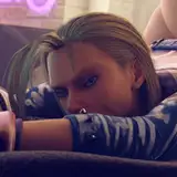
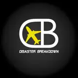
I just want to get some of your thoughts on something. I have had the same Disaster Breakdown channel Icon since day one, one I made back in 2016 in five minutes. I've been thinking about updating it to something a bit more modern and sleek and this is what I came up with. I am certainly no graphics design expert but let me know what you think.

This week's video will be out tomorrow on Early Access as normal. Thanks as always!

New Channel Icon Idea

Comments

I think it's great. It fits the main focus of the channel very well. Artistically, it's clean and I think it was a good Idea to have the aircraft a different color to keep it separate from the text. I like the shadows. One side thought that came to mind is that it might not fit as well with diverse content like the Hindenburg video. Another future idea is possibly finding a way to bring the different fonts together. I like how the banner text that you add is italicized.

Psydefect

Thanks Kristi!

Chloe Howie

Oh, I love this. It’s simple but eye-catching! And I like the mirror effect of the letters. Excellent job!

Thank you!

Chloe Howie

Thanks!

Chloe Howie

Thanks for the input, I'll consider it

Chloe Howie

I really like it, think it would suit the channel well.

Love, love, love new logo.

Love the logo, Very sleek and fits the channel well. The only thing I would suggest is the removal of the shading and making it a "flat" logo. Other then that I thinks its very cool. Looking forward to the new video


More Creators