I thought it would be neat to do a walkthrough of how I normally put together a page. Sorry for the low resolution, I had to screenshot this from the Photoshop file, but here's the general rundown:
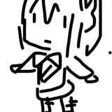
Step 1: Thumbnails
My thumbnails are probably more detailed than they need to be because I'm stubborn and a perfectionist. I try to get down basic gestures and proportions because it's easier to do that when everything is tiny. See my previous tutorial on laying out a page to see how I do thumbnails. There's actually a panel missing from this thumbnail that I couldn't find the sketch for because I rearranged this whole page a bit when I started sketching it. Note that I draw in an approximate position for speech balloons, too, because I ultimately want them to flow with the overall design of the page.
Step 2: Adding balloons and borders
I like to make sure I add my speech balloons early. Partially because it's an easy step to knock out (in Manga Studio at least), and partially because I want to make sure that there's ample space for them once I start my drawings. I try and leave space in case I end up editing any dialog as I go along, because there have been a few times where I have to add or completely change the dialog before I publish the page. (Staring at a page for a week will make you question everything about it. Sigh.)
Borders are stupidly simple in Manga Studio. Even if you draw the rest of your comic in Photoshop, I recommend using MS for at least this step. Honestly, it's easier to draw and ink in Manga Studio in my opinion. Photoshop has never made nice, clean lines for me, and I dread using it.
Step 3: Sketch layer
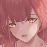
You can see that the fourth panel changed quite a bit! I usually run into one panel that makes me want to die, and this time, it was that one. I think I did...three or four variations to get a pose that worked right. I can't really describe why the first one didn't work in the end. Ultimately, drawing her at that high angle proved too difficult to get her facial expression to read when I cleaned it up, and it didn't quite flow with the page the way I wanted it to. Plus, it felt like too abrupt of a change to go SUPER WORRIED right after VERY DETERMINED, and this pose and expression felt like a better transition.
I try to make sure my sketches are tight enough that I'm not guessing like crazy once I go to ink, but also not so clean that I'm wasting time. A lot of times, with hands especially, I don't need a super clean sketch to produce a good inks. I spend more time getting the head and face correct, because that determines if the character design looks consistent more than any other aspect.
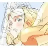
Step 4: Inks
These are a little out of order, because usually with a scene like this, I'll do fills for the characters and then ink the background, just because there's so much overlap. It kind of depends on my mood. I work at 600 dpi, which really helps once everything is shrunk down to 72 dpi and about a quarter of the size. My inks are preeetty clean, but regardless, there are always little spots that look a little too thick or a line that doesn't flow quite right, but those issues are largely not a problem at 300 dpi or 72 dpi. So work big! Reinking the same line over and over to get it perfect is probably not a great use of your time if its flaws aren't going to be obvious in print or on a computer. I ink using a Vector layer, which means I can infinitely scale or change that layer as needed, and it won't degrade the quality of my lines. It's amazing!
Step 5: Flats
People have a lot of various ways to do this, and most are probably a lot pickier about it than I am. The general theory is that all your colored areas should touch underneath your lines, and should be these perfectly selectable areas of color. There are a lot of tutorials on how to do that out there on the internet. Um...I don't really care. I'm inking digitally, I'm coloring digitally...If my inks weren't solid black, it might be a problem. In Manga Studio, you can set your colors to overflow by so many pixels (default is 6), and that seems to take care of most issues I would have with colors not filling up to the line. Manga Studio also uses a concept called Reference Layers, so I can fill on a separate layer from my inks, but it will fill the areas inside of my inked boundaries. Very fast process! Usually doing the fills on a whole page takes less than an hour. I do have to go back and get any spare pixels that didn't quite get filled, especially in her hair, but that's still not that time consuming compared so say, Photoshop.
Step 6: Shadows and highlights
This step is kind of fun. First, I ctrl+shift+click on the thumbnail for each of my fill layers to create a selected area to work on. (Shift will let you select multiple layers, so you eventually have a selected area that covers your whole character.) Then, I take a standard oil paint brush in Manga Studio, choose a color that doesn't look crazy (usually blue, purple, or pink), set the layer to multiply, and paint in big solid areas of shadows. I'll use a soft eraser to make certain areas less harsh. I like using the oil paint brush because it's not just a big solid blob. There's some variation in the opacity of it, especially along the edges. When I'm working on a really finished piece, like a chapter cover, I'll do a few layers for the shadows to give them a bit more depth, but comics require a bit more speed. Gotta get that shit up on the internet and keep moving!
For highlights, I keep the selected area, make a new layer and set it to Overlay, and then paint in subtle highlights along edges and sometimes in hair. (I don't really do anything to hair if it's black...because I don't want to.) I usually use a really pale yellow or orange for this. If I need the area to be brighter, I'll duplicate the Overlay layer, and selectively erase areas for some variation. I don't go too nuts on highlights, because I don't like things to look shiny for no reason.
Step 7: Paint Backgrounds, add effects
I use the same brush (Oil Paint Flat) to paint the background. I start by filling the whole page (Manga Studio creates mattes so even if you fill the whole page, it won't be seen in the area outside your borders), then I just paint in shadows and highlights. I like the backgrounds to look a bit more organic than my characters, because this helps the characters pop off the background a bit better. You want your whole page to feel cohesive, so I generally stick to a single palette. Even though trees aren't purple...they're purple for my purposes because it looks neat.
Step 8: Finishing touches
The last step is pretty fast, because I have a template for this part. I output a Photoshop file from Manga Studio, open my page in Photoshop, and drag and drop my template over the whole thing. My template has a layer of subtle grunge texture to add some soft variation (I have no idea where I got these textures at this point, but if you do a search for "subtle grunge", there are a lot of free/commercial free options in high resolutions), a layer of "noise" that I created with the Add Noise filter in Photoshop, a layer with my logo, and a layer with the text for the bottom of the page. Easy!
Then, I usually add some color to the background of the page with gradients (working at 600 dpi helps a TON with gradients), because I hate stark white backgrounds when she's wandering around at night. That's a personal preference, but it feels like night pages should have dark backgrounds.
Last thing I do is save my page, and then change the resolution to 300 dpi and do Save As to make a print quality Jpeg and another print quality TIFF (TIFF's are lossless, and a great format to save a print copy in). Then, I change the resolution to 72 Dpi, change the page size to 900px wide (by...something), and Save As a Jpeg for posting online. THEN, I close that sucker out and do NOT save it, because you'll be saving your original 600 dpi page as a tiny 72 dpi page, and that's useless.
So, by the time I'm finished, I've created a 600 dpi Manga Studio file (of a mostly finished page), a 600 dpi Photoshop file (of a finished page), a 300 dpi Jpeg, a 300 dpi TIFF, and a 72 dpi Jpeg. PLUS, one more 72 dpi Jpeg that I have to save at 800px wide for Webtoon. Sigh. This is why I had to up my backup space on the cloud to 1TB.