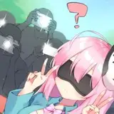
Which design do you personally like better?
Added 2022-12-16 04:57:14 +0000 UTC
Comments
Thumbnails are hard to make! I don’t envy you. I know the majority of people like things the way they are, but if you’re asking then perhaps you are looking for a slight change in direction. I gravitate towards something clean and easy to see like #2. #1 has a lot going on. You have some great expressions, but they are small in comparison to the rest of the thumbnail. You have the entire background set to compete with. It makes it a tad difficult to read the words. On my 24” monitor, sure, it looks fine. But when on a screen with competing thumbnails, especially a phone or tablet, it doesn’t grab the attention like the bottom one does. Us fans know what to look for, but you know how it is; most people who watch don’t subscribe so they are potentially new viewers. Perhaps there’s a melding of the two. Maybe you could zoom in #1 so you guys are closer. That kills the empty space on either side of the boys. Then add a dark cloud, like you find in Canva, behind the text to help it pop (pun intended). All of this could make it so we see the look of dejection on the boys faces without changing your thumbnail strategy dramatically. Best of luck with it; I’m sure you’ll figure out the winning strategy!
Newton Makes
2022-12-29 16:41:26 +0000 UTCFor this Holiday season, may you all find a person that looks at you the way Sal looks Flashpoint in #2.
Jason
2022-12-17 17:02:16 +0000 UTCWhat is this?! Options mean politics Sal! lol! I did like that Watchmen one for option two it seemed satirical for Alan Moore. For like first allusions go for this channel
Alistarline
2022-12-16 14:37:14 +0000 UTCI voted and then read the comments. My vote matches the comments...yet not the majority. I would remind that sometimes people like the familiar, but it might not get new viewers.
Christopher Wolf
2022-12-16 11:40:05 +0000 UTCThe first one is hard to see when small. It probably looks great on a 24" computer monitor. But you know how YT is. You are one of a lot of thumbnails on the same screen.
Newton Makes
2022-12-16 11:11:55 +0000 UTCSecond one puts your reactions more in the face of the scroller.
Blinky
2022-12-16 06:15:00 +0000 UTCI like the current design but I can 100 percent see that the other design is more YouTube click friendly.
John Holbrook
2022-12-16 04:58:19 +0000 UTC