New Potential Shirt Design! Feedback appreciated!!
Added 2019-10-30 19:05:55 +0000 UTC
Hi guys,
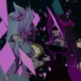
We're planning on adding a new shirt design to our store based on our Punching Weight series. Derek and I both like it, but I'm wondering if we should still include "Stop Skeletons From Fighting" or some other sort of context added in.
What do you guys think? Is it good as is?
Thanks! Grace
(p.s. new video will be up later today!)
I like the design but agree with DWV, Punching Weight Dude needs to go to the lower hem of the shirt. If you want to include n SSFF logo, may I suggest on the bottom of the sleeve or under the collar on the back? I love great design tees but don't overly like a large garish logo on the front.
Mr Rayner
2019-10-31 14:06:10 +0000 UTC
I think if you have a logo on there it should be the Punching Weight logo rather than the Stop Skeletons logo
2019-10-31 13:34:02 +0000 UTC
From the viewpoint of graphic design aesthetics, I don't like the way Punching Weight Dude is simply cut off at the waist. The design could work without a logo if only the whole body was shown, but a Punching Weight logo would draw the eye and cover up the missing lower half. Just an opinion, though.
DWV
2019-10-31 07:31:38 +0000 UTC
Most defintely needs the punching weight logo. Would most definitely be completed with some text. But its a dope shirt.
GunPuncher
2019-10-31 06:32:08 +0000 UTC
I would add the lightening city inthe background to add more motion and flair to it
2019-10-31 04:16:59 +0000 UTC
I’m all for it.
2019-10-31 02:23:18 +0000 UTC
this is a pretty cool shirt!
Stop Skeletons From Fighting
2019-10-31 01:44:22 +0000 UTC
i love this idea too!! i'm not sure but i will check. i love those new longsleeve shirts with the rad logos on the sleeves
Stop Skeletons From Fighting
2019-10-31 01:43:28 +0000 UTC
this is a cool idea!
Stop Skeletons From Fighting
2019-10-31 01:42:03 +0000 UTC
congrats!! wowza!
Stop Skeletons From Fighting
2019-10-31 01:39:25 +0000 UTC
Could definitely use the Punching Weight logo
Some Spoony Bard
2019-10-31 01:07:40 +0000 UTC
Also i really like the design / picture!! :)
2019-10-30 23:39:28 +0000 UTC
In this example (the awesome hard drive shirt!), the ltt logo is in the back. (One of the pictures)
https://www.lttstore.com/products/hard-drive-shirt
2019-10-30 23:37:23 +0000 UTC
By the way, the ltt logo of linus tech tips on their shirts is very small... (unless you get the bold letters shirt)
2019-10-30 23:35:36 +0000 UTC
Yes, put ssff or stop skeleton from fighting... i might buy one :) i bought a linus tech tips tshirt and what is Nice about it is people ask what the tshirt is about... free publicity!! I'll have to remember why your show is called ssff hahaha
2019-10-30 23:34:15 +0000 UTC
Hi Grace! Would it be possible to get Stop Skeletons From Fighting on the sleeve? I think that would really bring things together.
James Peters
2019-10-30 22:48:14 +0000 UTC
The Punching Weight/not-Shatterhand guy is a good start, but I would definitely recommend the SSFF and/or Punching Weight logo somewhere, or it'll just look like one of those cool indie artist shirts everyone has these days. Rep the brand!
J.M.H
2019-10-30 22:06:04 +0000 UTC
Agree with some others that a punching weight logo would really tie this together!
Spiralofvertigo
2019-10-30 21:39:44 +0000 UTC
Also I agree with SammyCola
Blake Wall
2019-10-30 21:33:04 +0000 UTC
It looks good but it might be better with a purple border around the design to make it pop a little more ( I may be in the minority on this one so keep that in mind)
Blake Wall
2019-10-30 21:31:43 +0000 UTC
Just in time! I dropped 70 lbs and my 5x SSFF shirt is a little baggy now
Zeromaster
2019-10-30 21:04:50 +0000 UTC
I think having either a pixelated punching weight or SSFF logo on the bottom or above would help fill it out a bit more
Golden Prince
2019-10-30 21:02:59 +0000 UTC
I think that merch should advertise you a little bit - the image is great, but no one will really know what it's from unless they know.
Jason Hurley
2019-10-30 20:40:29 +0000 UTC
Imo should add a punching weight logo to give context. Having a SSFF somewhere could be a nice touch too.
2019-10-30 19:51:34 +0000 UTC
It does feel like it's missing something. I think a SSFF or Punching Weight logo underneath would look better.
Alexa L.
2019-10-30 19:39:08 +0000 UTC
Gotta echo the others in that it needs something branding wise to pull it together.
TankErdin
2019-10-30 19:22:14 +0000 UTC
Awesome design, but I think the text "stop skeletons from fighting" below it would look rad.
John Drew
2019-10-30 19:19:26 +0000 UTC
I love the design! It's simple and clean. I think it would look better on a different colour of shirt but I don't think that was particularly part of the question. Maybe add the SSFF on the back for that comming and going effect? Also SSFF is wonderful and I love you all so much! ✌❤🥔
2019-10-30 19:18:45 +0000 UTC
What about a different color scheme?
Jay Thomas
2019-10-30 19:15:58 +0000 UTC
It does feel a little empty, but I tend to prefer shirts that don't have logos or text
Collin Json
2019-10-30 19:13:10 +0000 UTC
I love it as it is :)
Greninka
2019-10-30 19:12:14 +0000 UTC
It feels like it's missing something. I think the shirt could go with the actual punching weight logo underneath him.
2019-10-30 19:11:46 +0000 UTC
Sounds really specific, but "Stop Skeletons From Fighting" on a shirt with no skeletons strikes me as too... needlessly referential? I hope that makes sense.
Slapping "SSFF" in bold letters BEHIND Punch-Face, though? Iconic.
JLunaarS
2019-10-30 19:10:25 +0000 UTC
Would definitely prefer more going on in the shirt.
2019-10-30 19:10:23 +0000 UTC
yeah, the title in the t-shirt will be nice and a good ad (?)
Anto5 the hedgehog
2019-10-30 19:08:27 +0000 UTC
I like it. But it feels kind of empty compared to the other shirts IMO
Djurre van der Veen
2019-10-30 19:07:52 +0000 UTC
It seems a little bland. Maybe the graphic where he's punching and the glass is shattering would be better?
Amy Veeres
2019-10-30 19:07:38 +0000 UTC
I think that the "Stop Skeletons From Fighting" would look sick if it was underneath the design. Will definitely be buying this one!
Chris Hensch
2019-10-30 19:07:27 +0000 UTC