Ads and Ideas
Added 2025-06-05 16:00:12 +0000 UTCOkay, I've been playing around with Ad ideas for a bit I thought I'd throw them up here for fun. Most of these are an 'excerpt ad' style, which is admittedly the easiest ad to create. I've heard from some creators that these ads can work quite well.
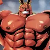
The other is, of course, the honorary super stupid four panel comic ad.

Excerpt Ad #1
I played with different outlining techniques after this so that I didn't have to darken the background image so much. I don't think the excerpt is as strong as the next one though.
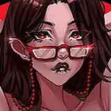
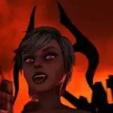
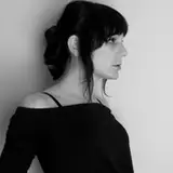
Excerpt Ad #2.
Definitely my favorite. The outlining lets the text stand out while keeping the background bright enough to be seen. The excerpt is also strong, though it doesn't ring with the story quite so strongly.
Lucifer is just so quotable.

Excerpt #3
I don't think this excerpt is quite so powerful, but it does have a very different flavor. The astute might notice at this point that I slightly tweaked some of these excerpts to hide important details, make them fit, or render them more family friendly.
Sylvia, for instance, thought 'Fuck' at this point.

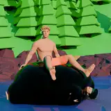
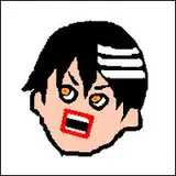
Mandatory Stupid 4 panel ad
Here you get the privileged of witnessing my incredibly crappy Gimp based art. It was kind of fun to create, but I'm not sure I actually like it. Note, I have the master file with all the layers saved so I can tweak this pretty readily if need be.
Final Notes
I just thought I'd share. Throw up your vote for which ones you like best. This time I'll let you just throw your hat in for what your favor. If this march of stupidity inspires you, well then, go ahead and share your own ideas!
As for me, I'll probably go with excerpt #2 as the main ad. I might pay for a second ad for fun, in which case I'll go with the stupid 4-panel just for variety's sake unless you guys think its too dumb. Running a dumb ad, after all, is a RR right of passage.
As a final side note, patreon has been absurdly, ridiculously slow for loading recently. Has anyone else seen this problem?
Tweaks Addendum

Excerpt #1 Alt: I trimmed the 'Esmeralda' part out of the text, shadowed the letters so they stand out better, then used that to brighten the background.
Comments
1 and 3 are definitely better, especially in term of spacing, 2 is a bit too cramped I think I prefer 1, as even if it's cliché, "Why me" works great
Lijwent
2025-06-08 00:19:57 +0000 UTCI'd like to point out that ads on RR will appear smaller than what you've posted here and all that text will be difficult to read, which would put off a lot of people, myself included. I'd suggest just using the background and writing the name of the story. Sometimes simple works best.
MadGod
2025-06-06 00:05:06 +0000 UTC