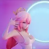
So first, I started with the initial sketch, I used different colors to separate the different entities is the gif so I wouldnt get confused and what’s what. I did this animation in 2’s. That means that each frame is actually 2 frames. So every frame is shown twice before it moves on to the next. For example, The initial frame of the animation plays on frames 1 and 2, and on frame 3 and 4 is the next frame. I was planning to go over my rough sketch with my lines so I had to make sure that the rough sketch was competent enough animation wise to translate it to clean lines. If you animate yourself you might want to do a really rough and unclean animatic before the sketch phase that doesn’t go frame by frame in order to help visualize your animation. I’m lazy af so I skipped that step and went straight into the sketch. The sketch is where you want to think about layout and construction a lot to make sure it’s good for later stages. You can see in some frames that Jill’s vagina is showing. That’s because I wanted to make sure I knew where it was so everything in the surrounding area matched up with it fairly well
Moving on the the linework portion, I used a custom brush at about 30 pixels wide to do the lines. In all honesty, for animation it’s a lot easier and more consistent tou use a brush without varying width but I just happen To really like this brush even though it messed up the line consistency. In the GIF of the linework you might notice some lines are colored. This is just because during the coloring process I color some lines too, so when I captured this version of the GIF, the lines were already colored. I do all my lines in black and only color them when I finish coloring the image. The linework needs to be much cleaner than the sketch and this is usually the phase where I make minor changes to what I envisioned in the sketch. For example, the tentacle on the vagina has more of a rhythm motion to it int the lined version than the sketch version. I thought this would help accentuate that area of the body to make the tentacle more distinct and visually interesting than the others.
It’s worth nothing at this point that all of my lines and colors are kept in separate animation folders. For example, Jill’s linework and her colors are on separate layers. The STAAAAARS word’s line art is below everything and the colors are below that. The foreground elements are a static image above everything as to cover everything up. So all in all I had 3 folders for the linework, 3 for the colors, and 2 layers for the foreground.
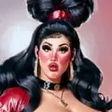
For the coloring, I actually baked the shading and highlights into the actual color layer. I don’t usually do that for illustrations since it’s destructive but I’m still new to animation and I couldn’t figure a way around it. So all the shading and highlights shares a layer with the flat colors. In animation I like to keep shading and highlights to a minimum because they’re hard to keep consistent, so I only highlighted key areas minimally, like Jill’s hair, both character‘s eyes, and Jill’s nipples. Similarly, the shading was done in small quantities to give a little depth to Jill and Nemesis. Coloring Jill’s entire background arm darker to give her more depth and some moderate shading on her skin and eyes to make them have a little more dimension. I tried keeping colors to a small pallette on both characters to make it easier to animate. For the STAAAAAAARS words I first did the line art in black, colored the inside of the text yellow and then colored the lines blue to reference the Capcom logo.
The Animation in total is 38 frames with each from appearing twice, so I had to animate 18 frames total. Jill only has 4 frames of animation that loop constantly. Nemesis has 8 total frames but a lot are reused during his animation. Once he enters the peak of the yelling animation, he swaps between two frames on repeat for a little while to achieve the desired “hang” effect to match with the text animation. Then I essentially play his animation in reverse to get him to go back to the resting position, with one new frame added in to transition the yelling back to resting because previously, going from resting to yelling, I used a smear frame to make it pop. I didn’t want him to zoom back to resting position by using the smear frame again so I replaced it with a new frame of animation to have the return to resting be more natural. The words take up the most of the animation frames with there being 16 total frames for the word animation. The only time that frames repeat during this animation is at the peak of the yell, where I use the same technique of swapping between frames I used on nemesis to make the words stretch and hang for an extra second. I could have reused a lot of the letters by keeping them still the entire time and only animating the ”As” but the animation looks way more fluid by redrawing it all by hand in this case. It gives the text a nice organic and natural flow.
Remember! You can have access to this GIF’s .clip file and rummage through it yourself at the $5 tier! Thanks for reading!