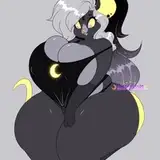
About the combination of the character and the background
Added 2022-04-30 22:16:11 +0000 UTC
My most intelligent face should be here. But my face is usually not smart at all, so there is no image))
I'll just share my thoughts on how I understand the best combination of characters and backgrounds, and why I think so. And I'll also show you how I do it in practice.
I. What is it all about?
I've always liked 2D cartoons. More than 3D and even than art cinema. It seemed to me that there was some great "liveliness" in 2D animation.
For some reason, I received much more emotional feedback from the characters of "Tom and Jerry" than from the heroes of "Ice Age" or "Madagascar" (even taking into account the fact that these 3D try to look as caricatured as possible).

The drawn two-dimensional Genie from "Aladdin" in 1992 gives such a surge of emotions that even such a brilliant actor as Will Smith from the recent film adaptation cannot give.

At the same time, if you just take a cartoon character and add detail, texture and realism to it, it will turn out very creep! О.О

I also had another question. I noticed that in some 2D cartoons, the backgrounds were worked out incredibly carefully and in detail. It was mostly in full-length cartoons, such as "Sleeping Beauty" or "Beauty and the Beast".


However, even in the series, they tried to make the background more realistic in less expensive ways, for example by adding textures or patterns. Such as point textures in shadows and plaster textures in recent DuckTales.

Or the effect of a pencil drawing on paper as a background texture in "Hey Arnold".

And it happens the other way around, when the backgrounds are drawn as caricatured as the heroes of the story. To me, such an environment seemed abstract and even absurd, as if these houses in the background were about to start singing and dancing.

II. Our perception of characters and environment
It didn't really fit in my head why I like less realistic characters in a more realistic environment. I got the answer after reading an excellent comic book "Understanding Comics: The Invisible Art" By Scott McCloud.
I highly recommend reading this entire book :3
It turned out that it's all about the difference in the perception of yourself and the world around you. This difference really exists, and this is what the author himself tells us (let me quote the entire 2 pages from this book):


Further, the author says that by minimizing the material world to a caricature, we display the inner, what we feel. But by drawing the world realistically, we display the external, material, what we see.
Caricature animates objects, but loses their materiality. And vice versa.
That is why many artists draw cartoon characters that are not realistic in detailed realistic backgrounds. "One set of lines to see, another set of lines to be." ©
Just look at how the most famous anime creator Hayao Miyazaki uses this principle (a frame from the anime "My Neighbor Totoro"):

The most simple but emotionally charged lines for the heroine, and a detailed background drawn with love for nature.
This is exactly what I love most about animation. And that's exactly what I'm trying to do myself.
In fairness, I will note that I still add volume to the characters so that anatomical details are visible. This makes them sexier and fits better with the background, which I usually do in 3D. However, I try to make the overall silhouette and the lineart more simple and cartoonish. And the background is more detailed and elaborated.
III. How am I doing this?
I'll show this with an example of art for a recent animation with Judy Hopps.
1. I work out the background in detail, render it in the 3D Blender program and apply the following effects:

2. A completely different approach to drawing a character. Initially, this is a rough sketch, on which I designate the very rough caricature lines that are supposed to convey feelings of emotions and poses. Then they turn into a lineart, and then I add color and volume.

3. Now I want the cartoon character and the elaborate background to become friends. To do this, I apply 2 effects:
a). Vignetting, Chromatic Aberrations and Film Noises. I wrote about these effects in detail here: https://www.patreon.com/posts/why-do-i-apply-3-62901818
This adds a cinematic effect to both the character and the background, and also blurs the edges for additional emphasis on the center of the frame.

b). I'm adding a general color correction or similar effect. In this case, I added warm rays of the sun, which make the color scheme of the character and the background more similar, and the whole picture more warm and pleasant.

And we got a great result! The background looks detailed and authentic. The character looks quite cartoonish. And this is exactly the combination that was required! At the same time, everything in general looks uniform, no details look foreign. To my taste, the task turned out to be solved very well.
You can see the full version of the animation here:
https://www.patreon.com/posts/judy-hopps-uncut-65693893
I hope it was useful for you! And see you soon (^.~)☆
Comments
That's right! And I'm glad you think so too =^_^=
Kotyami
2022-05-01 08:45:16 +0000 UTCI think detailed backgrounds with cartoon characters look great. Especially when the light and shadows on the characters match up with the lighting of the background. It creates an illusion of depth within a 2dimensional space and brings them to life.
Slikfiji
2022-05-01 07:37:47 +0000 UTC