Greetings! Today I will show you how I made a recent art "En plein air" (on the example of the first of this series of art).
In this art, many viewers were most pleased with the elaborated background, so I will pay more attention to it.
As often happens, I do some stages of work in one file, others in another. To make it easier for you to understand the PSD sources (of which there are already 3 pieces, links to which will be at the end), I will write in the text exactly where I go from one file to another (and why).
1-1 - The idea is simple and funny. I thought: "What would I like to draw for the YCH auction?" And I came up with an idea: I will draw for the auction winners the way I draw them! 😃
Simple and elegant. And the best thing you can come up with is drawing from nature somewhere on the shore of the lake, i.e. en plein air.
Here are my first rough sketches:

1-2. This was the first time I did YCH with multiple OC at once. I really liked it!
And pay attention to the composition, I tried to think it over for the first frame in more detail. The lines of views, as well as the lines of the terrain, the line of the hand - all this draws our attention to the main advantage of the central character.

1-3. Looking a little ahead, I will show these lines in more detail. All these red arrows lead us there, except for the look of the character himself, which takes our gaze back, but only to return to the most interesting thing again.
I also marked the details with blue lines, which I tried to make parallel. To my taste, when there are repetitive details in art, or parallel lines - it's like a rhyme in poetry, they make the overall composition stronger and more pleasant.

2-1. Focusing on my first (rough) sketch, I made a 3D scene in the Blender program. I created these rough models in the DesignDoll program, and made the heads myself in a Blender using sculpting tools. I found tree models on the Internet.

2-2. Then I asked myself the question: how would it be better and more convenient to make grass? I could draw it by hand, but it's too long and not too realistic. I could find a suitable texture (you know, these textures with volume), but textured grass usually looks quite flat.
I studied various plugins for Blender and found the one I liked the most - Polygoniq. Of course, you can buy it on the official website, but if you search the Internet carefully, then... let's just say there are other ways to enjoy the work of this plugin))

2-3. It works surprisingly conveniently. To demonstrate to you, I made this gif, on which you can see that places where there will be a certain type of vegetation, you can just draw with a brush. Simple and convenient (however, you need a fairly powerful computer).

2-4. And here (for clarity) is a ready-made render of the previous scene. I supplemented it with stones (which can be "scattered" on the surface in the same way - with a brush) and rendered.

By the way, I use the "Physical Atmosphere" plugin as lighting. It is very simple, so I will not write about it in detail.
2-5. Back to our scene. In addition to grass, I also scattered simple models of trees in those places on the background where they should be visible. This is how it began to look after using the vegetation plugin.

2-6. If you're curious, a couple of other angles.

2-7. That's the whole "world" from afar. I feel like a god when I render from such a height)) As you can see in the picture, I accidentally created a "flying tree", which fortunately did not get into any of the frames))

2-8. When you render images, you can get not only the image itself, but also a black and white image that will give you information about the depth of the scene.
I use this depth in order to apply different filters in Photoshop (you can see them in the source files) so that the scene looks better (as in the picture below):

2-9. To prevent the background from looking "like 3D", I use the "Exposure SnapArt" plugin in Photoshop.
It turns any image into something that looks like it was painted with paints. But I use it only a little bit, just to smooth out the overall impression and bring it closer to my drawings.

2-10. For example, if you apply this filter in full force to the screenshot above, it will turn out like this. This is so you can see how it works.

III. Characters.
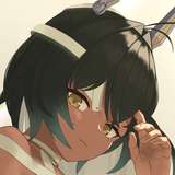
3-1. So, we got to the characters. I got all the necessary references from the auction winners and drew them for our scene.
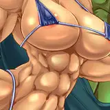
All these curves of muscles and relief, folds of clothing, everything that was not in the original renderings - it's all drawn already in Photoshop with ordinary brushes, without 3D (except for small details like horns, bells, scarf).

3-2. Neat linart.

3-3. Filling with a flat color, which I always like to add a red blush to, which makes all the characters more lively.
This is how flat colors look if you remove the mask from them, which restricts them to the contours of the characters =)

3-4. An important (but boring) stage of work is the creation of selections of certain areas.
A very common situation: I look at the volume and I want to add more light to the character's arm, or add a shadow under his head. To do this, I make several layers as in the picture below.
After that, working with selections (a very frequent operation) becomes easier and faster: to select the legs, it's enough for me to click on the mask of the red layer with the Ctrl button held down.

3-5. The volume created in paragraph 3-1 does not separate the objects of the scene well enough. So that the head does not look smoothly flowing into the neck, it will be great to add an additional shadow under it.
This way we will better separate the front objects from the back ones, and also add shadows to those places where the light penetrates less (like deep places under the eyelids, under the hair).
Technically, it's not quite right to call it the phrase "Ambient occlusion", but I call it that for simplicity.

3-6. Next, I add small corrections, like highlights and shadows.
But by this point, my working PSD file had become very large and unwieldy. All these layers with backgrounds, adjustment layers, character color, volume, shadows, highlights - you can see in file #1.
For further work, I combine the entire background into one layer, everything related to the characters into another layer, for convenience, I leave an easel in a separate layer. And I save it as file #2.
In the new file, I immediately make adjustments with plastic (as in the gif below), and also add color adjustments and correct some small details (for example, I make the dragon's nipples a little darker, remove the extra glare at the tip of the tail, etc.).

3-7. In February, I made a detailed story about several post-effects, which I have been trying to always use for some time now: these are Vignetting, Chromatic Aberrations and Film Noises.
The post is available at this link: https://www.patreon.com/posts/why-do-i-apply-3-62901818
For convenience, I combine everything that was done in file #2 into one layer and save it as file #3. In this new file, I apply all these effects to the whole picture (but only slightly, so that they are not too conspicuous).

3-8. Everything is ready! You can see the final results in my previous posts at these links:
https://www.patreon.com/posts/ych-en-plein-air-64786007
https://www.patreon.com/posts/ych-en-plein-air-64845355
https://www.patreon.com/posts/ych-en-plein-air-64894322
https://www.patreon.com/posts/ych-en-plein-air-64938275
https://www.patreon.com/posts/ych-en-plein-air-64969459
Please note that in this art I am drawing a picture that is made of the same art but using the SnapArt filter described above. Like many artists, in this picture I slightly "exaggerated" not only the muscles of the dragon, but also his "device"))

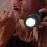
3-9. And one interesting detail. If you take the latest art and greatly enlarge the picture, you can notice the brand of the camera: FURRYFILM. It would be cool if such a company existed))

And here are links to PSD sources:
File #1: https://disk.yandex.ru/d/TeqCKn5vlGdoPQ
File #2: https://disk.yandex.ru/d/rs7Vn5Ok7Glitw
File #3: https://disk.yandex.ru/d/5kTfcxYg09WedQ
Thank you, dear readers, for your support! I hope this post was interesting and useful. I will try to make another similar post before the end of the month. See you soon! 😉