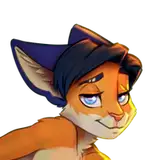
Distracted Fox — Process of creation & PSD-source
Added 2022-01-25 15:49:01 +0000 UTCToday I will share with you the details of the creation of one of the latest art - Distracted Fox. I really like it, so that I myself use this art as wallpaper for my two monitors (but more on that below).
I have long wanted to write my favorite characters into this meme (they are too much in line with this situation), and you can see the finished result at this link: https://www.patreon.com/posts/distracted-fox-61371185
01. So, I started with a reference. Actually, I downloaded the meme picture itself, and I also found another photo of the same photographer in the same place, as well as a photo where the girl's red dress is better visible.

02. With the help of the "DesignDoll" program, I created poses, and then in the "Blender" program I added 3D heads, tails and one small hare penis that I had made earlier))
I used to use 3DS Max for similar purposes, but I liked the Blender program so much that now I am actively exploring its capabilities.
I used the reference-like textures of tiles and walls on the right and left, as well as an HDRI map with soft daylight). The lighting turned out to be similar to what was needed.

03. Even though I use a 3D render, I don't circle the contours. I use the render as an approximate reference, and make the lines more free and dynamic so that the result looks more lively, artistically and emotionally.

04. Based on the sketch, I make an exact lineart and add flat colors.

05. Instead of adjusting my lines to the render, I do the opposite: I adjust the render to my lines. And at the same stage, I manually finish drawing all the necessary details in Photoshop using a pipette and a brush.

06. The result - volume, lineart and background.

07. And this is how it will turn out if we put a layer with volume on a layer with color in a rather tricky way (you can learn more in the PSD file at the bottom of the story).

08. But something is wrong. We definitely lack a sense of volume! So I draw shadows in places where there is some depth, or I just want to separate some objects from others. Then this layer will be applied in the "Multiply" mode.

09. I add glare to the eyes and additional light from above (for clarity, I show them separately on a dark gray background).

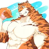
10. Our main picture is ready!

11. Now to the question of clothes. When I was drawing Nick Wilde's shirt, I noticed for the first time that in the movie he wears two different ones! When Judy first meets Nick, he has a yellow shirt, and when they meet again closer to the middle, his shirt is already green (but with the same pattern). Maybe it's obvious to many people, but it surprised me))
This is how my reference looked to draw everything correctly.

12. After studying the clothes, I drew a linart and made flat colors. For Nick's shirt, I found this pattern on the internet.

13. Using the same volume layer (taken from a 3D render), I finished drawing the folds of clothes in the right places.

14. And we have everything ready! But by this point, there were so many layers in my PSD file that I decided to move everything to a new file for post-processing.
Therefore, everything that happened up to this point (inclusive) you will find it in file #1. And everything that happens next will be in file #2.

15. So, I just copied our bunnies and fox on a transparent background to a new file, adding the same background there. Then I played a little with the Liquify tool to improve the shapes (especially the shape of Judy's ass).

16. Kotyami's Life Hack!
Recently, I've been trying to always use one little trick. In Photoshop there is a tool "Lens Correction", in the settings of which you can make the effect "Chromatic aberration". You can see this effect in photos closer to the edges of the image, when different colors seem to be stratified.
This effect is not striking, but gives the image more photorealistic.

17. For the final correction, I found the texture of the film on the Internet, plus added noise and made some color correction. Below you can see these effects if they were applied to a flat gray color.

18. And this is how the previous step looks in our image.

19. Everything is ready!
It may seem to you that such work with volume and light is unnecessary. But thanks to all this, I was able to create such a warm summer atmosphere and good authentic photorealism, while leaving the cartoon dynamics of lines and facial expressions.
I liked the result so much that I made expanded wallpapers for my monitors from two versions of this art. This is what my workplace at home looks like now :3

PSD sources (both files) you can download from these links:
File #1: https://disk.yandex.ru/d/aG2hRt9zlUV-SQ
File #2: https://disk.yandex.ru/d/UeCzzT2HSb0nPg
Thanks for your attention! I hope it was interesting for you and may even be useful.
=^_^=