XaiJu
sinope
sinope

patreon


The Many Shades Of Little Lorna!

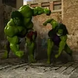
I was rethinking colors and the "Look" of my comics and did some tonal variations of what I have for this page.  As you cycle through them, which ones look best to you?  Which ones look clearer?  The B+W versions are maybe an idea for other comic series' and for $3 level supporters.

Little Lorna gets some pretty rough treatment in this comic but other ones will have more loving and family!

The Many Shades Of Little Lorna! The Many Shades Of Little Lorna! The Many Shades Of Little Lorna! The Many Shades Of Little Lorna! The Many Shades Of Little Lorna! The Many Shades Of Little Lorna! The Many Shades Of Little Lorna! The Many Shades Of Little Lorna!

Comments

Third color is crisper. I also like the first b/w

Avery McCreedy

well it seems clearer and crisper than the others to me . . . as well as brighter. 01a would be a 2nd choice . . . don't like the gray overlay at all . . . just dulls things to me . . . maybe just my old eyes . . .

RH

Interesting. 01f-copy has no shades or highlights. Do you find those distracting or too intense? Maybe that’s the problem with the others.

Julia Sinope

For color 01f%20copy by far. For B/W 01c

RH

My favorite is the third where you can actually see the print of the stockings, knowing how much effort that is though I like the brighter colors of the fifth and fourth then first. The second looks the most washed out making it harder to tell the details but with the detail lost in the sixth and seventh the backgrounds make the story less solid. Still I think there is a place for the black and white when you want to show more detail as color and shade can sometimes get in the way. 3 > 5 > 4 > 1 > 8 > 2 > 6 > 7

Marsh

I like the 3rd one :)

Jamie W


More Creators