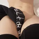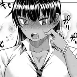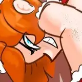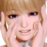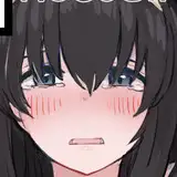
EDIT: Realized Mary's tongue was a bit too long, so shortened it a little.
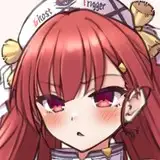
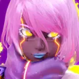
And I'm just now getting a message that Halloween is, in fact, next Monday. Well next Monday is a strip week, so we're doing this now! This year it's the twins representing TRW. I thought about making one of them an angel for visual variety, but they're delinquents so two devils felt appropriate. XD
The reason this one's posting a little later in the night because I wanted to take a swing at some graphic design elements on this year's Halloween magnet. I swear I spent more time messing with that trick or treat logo than I did with both twins combined, and I'm still not entirely happy with how it looks. A funny contrast is that I think this is my personal favorite picture of these two I've ever done, as far as the artwork goes. So of course the logo is what drove me insane. If anyone has any graphic design pointers or feedback they'd like to share, I'd be happy to hear it. In the meantime I hope you like this pic of the twins, and that you had a good Monday!
Reinbach
2022-10-28 02:02:42 +0000 UTCReinbach
2022-10-28 02:01:11 +0000 UTCReinbach
2022-10-28 02:01:02 +0000 UTCReinbach
2022-10-28 02:00:56 +0000 UTCReinbach
2022-10-28 02:00:48 +0000 UTCReinbach
2022-10-28 02:00:38 +0000 UTCReinbach
2022-10-28 01:59:47 +0000 UTCSquid Hills
2022-10-27 17:28:48 +0000 UTCBK
2022-10-25 15:50:23 +0000 UTCJayson
2022-10-25 13:12:24 +0000 UTCLicorice Lain
2022-10-25 12:33:25 +0000 UTCMr. Bug
2022-10-25 11:25:29 +0000 UTCCtM
2022-10-25 07:15:30 +0000 UTCJariah Synn
2022-10-25 05:49:36 +0000 UTC