![Process - 'Light touch' [ENG]](https://img5.xaiju.com/storage/6/jb/mk/d38796-019e8e3e-ee5e-7d9b-8af1-2b22beee4de2.jpg)
![Process - 'Light touch' [ENG]](https://img5.xaiju.com/storage/5/hk/xf/d38796-019e8e3e-ee60-7b17-a1ae-65929d898b38.jpg)
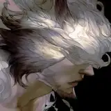
Paintstorm Studio / Cintiq pro 24"
Uh, to avoid making a simply repetitive commentary, I'm going to skip some of them --because they are almost the same as last month-- but also add something new in other aspects.
# Rough sketch
 Comparing to the sketch I did last month, you can see a significant (not really) difference-- I'm using blue. A kind of blue which is closed to the primary color (also called X11 blue). I want to test if this is better for me to focus more on the structure/composition. Even though I'm feeling I'm also risking hurting my eyes...
# Designing the main part
 Before I managed to confidently & comfortably draw into details, there were actually days of me struggling. I've mentioned in the last post that a stand for my Cintiq just arrived, so the standing angle is finally adjustable (the default Cintiq only have two choices, 5 and 20 degrees). I guess I should make another post dedicating to this topic, hmmm :/
Here's a doodle of me trying to adjust everything, the Cintiq standing angle, the brushes, even the height of my chair, etc..
Then I accidentally found a better angle to work on, and the picture below also shows a distinguishable difference of me using three kinds of brush tips: The same posture of one same character. But result C shows more perspective, and also more dynamic. Using some custom fancy brush tips like A and B may be better for polishing the line quality, however, they also make it harder for achieving the dexterity of drawing. So, uh, the default round brush became my selection of completing this work. Here is also a comparison of four attempts to design Dante's body:
 I may be obsessive of finding the ideal forms, curves, exaggerations, but anyway, in the D result, everything suddenly came out naturally. So I guess the dexterity of a soft round brush helps in this case. So, does default round brush tips solves all my problems? NOPE. When one problem goes away, another arises.
Luckily, I have lots of old works in my memories bank. Years ago I adapted to an odd habit on Painter & PaintToolSAI, using very light opacity and heavily textured brushes for finishing drawing. It feels intuitive and capable of defining very complex forms. But while creating comics, this habit became a critical issue, taking too much time to complete everything, and you're required to draw so much object/characters on every page and eventually, getting worn out is just a matter of time. (Guessing I need to make another post talking about this :/) It's good for illustration, but not okay for doing comics.
Which is also why I've spent years trying to adapting using sharp brushes. But again, I'm doing illustration now. And getting fewer likes while posting works on social media seems a warning sign, showing the result of me using sharp lines are just not an ideal option. And here is a comparison: A. Sharp brush
B. More textured & less opacity brush
So I chose B for this work. Here I'm going to introduce my brushes again. You can also download them from the attachment. Nothing fancy though, and probably every artist knows how to make these brushes LOL (For the description of rest brushes, you can see them in this post)
# Designing additional parts

Here's another picture shows the progress of designing: Shield: I designed the shield constructed by feathers. But it appears distracting and confusing-- Is it a wing? Or a shield? So I just go for the B option--it is a shield, after all.
Wing: Actually all of them are not that different, but the C option seems stronger because of the humerus part (tertial, root part) is bigger, and the bend of joints makes it easier to see the perspective of the wing.
# Clean the lines Import the work to Photoshop, adjusting the blue to black, and clean the messy part.
# Flat colors and adjustment I don't have a strong sense to know how to make a fancy result with flat colors. ;o; Anyway! Here's a chart showing how I accomplish the final editing in Photoshop:
And here's something additional: I'm using two FHD monitors and one Cintiq for work. (The second FHD monitor is optional) I'm getting questions of how do I use reference, so here you go! And here are links to those reference/software:
Finally! Thanks for watching! I wonder who's gonna need this kind of commentary TBH. *sweating* But documenting my progress is useful for myself to memorize and avoid making the same mistakes. So yeah I'm still feeling lucky to have a blog on Patreon. 😅