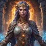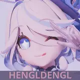
Days ago I posted a color test of Dante's head. After several attempts of trying I decide to learn how to improve values again. This time I'm aware that better not to go full-realistic, but just focus on what the form is presented on the canvas. And I get this below image in result.

Well, it failed.
I have been very easily confused about what should be added on my canvas when I need to refine the value and forms at the same time. It often ends up that I switched to my drawing brain and try to add more small shapes/forms rather than values. Either way, the value is too confusing and the image is unpleasant to read.
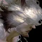
Then I searched my memories and decided to find some art reference which are good with values. And well, the GOD OF VALUES, the first one come to my mind is Ruan Jia. If you don't know him, you better google him. And also get his brush pack. (supposedly you can find it on tumblr)
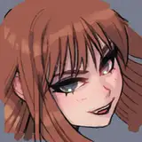
So I put his art on my second monitor, both colored and grey-scaled, load his brushes to test on my working monitor, and I get this result:

I mean the form is quite loosely done since this is only for testing brushes. But this time I kinda felt the power of value. It's like if the value is right, the whole image will be very easy to read and easy to know where to paint. It's not like his brushes possess magic, it's because 90% of them are set as 'pressure for opacity'. This kind of setting is often good for creating values...but hard for defining shapes.
Anyway, I'll try to improve both the form and value next time.
-------------------------------
前幾天我丟了張蛋丁的大頭上色練習,之後又試了幾回、又失敗了幾回,接著決定再來改善灰度(value)的問題。我心中有某個聲音告訴我,只要灰度對了,塗什麼顏色上去看起來都是對的(純屬瞎猜)
這次我告誡自己不要走純寫實,而是該盡量想辦法完成一個完整的型體(form)。成果如圖:
總之是失敗了
不得不說我非常容易在灰度處理不良的情況下直接轉換成線性思考,變成一直在玩輪廓連連看(太辭窮只好這樣比喻),想說「鼻子形狀是這樣但灰度對不上怎麼辦?啊欸那就把那邊那塊灰色填過來吧。」但其實這樣的處理邏輯是很有問題的。結果是不管我怎麼想法子把形狀對上去,加上更多的形狀設法掩飾灰度混亂的問題,都救不回這顆頭。都畫他十年了還是一直失敗,感覺就像我在死守蛋朵這對一般地悲摧(離題)
後來苦思一番,決定來觀摹大師作品,想來想去覺得能把灰度處理到極致的繪師,我第一個想到阮佳。如果還不曉得他是誰的話拜託請google,還有請務必順便挖挖他的筆刷。(沒意外的話可能湯不熱上還有載點)我把他的數張作品轉成灰階放在旁邊當參考,然後進PS載入他的筆刷畫了張實驗圖:
純屬測試,除了頭以外都很混。但驚喜地是頭部的灰度處理比我想像中還順利。彷彿只要灰度對了,就會知道整張圖的焦點在哪,就會知道接下來該怎麼畫。但也不能說是這些筆刷有魔法還啥的,而是這些筆刷有90%都設定成「筆壓控制透明度」,其實這本來就是針對畫灰度常見的筆刷設定,基本上只要強迫自己盡量使用帶筆壓透明度的筆刷,都能得到類似的效果。缺點就是這種筆刷比較不容易快速畫出清楚的形狀。
總而言之,下次的練習應該會以同時改進型體&灰度為前提。
Mary B
2018-07-09 18:37:56 +0000 UTC