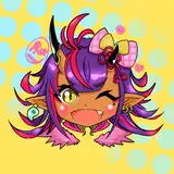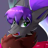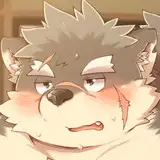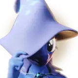
Coloring for this guy
Pic 1 is the base color, I have trouble with purple sometimes so I wanted to give myself more experience with it.
Pic 2 is something I mean to do more often, which is apply gradients directly on top of the base color. This achieves two things: color variation and the indication of light fading out on the edges of a form. I usually pick a darker, warmer color, and set these on hands, feet, and parts of the face. This is because these parts of the body have thinner skin and are usually more translucent, so the color of blood is more visible.
Pic 3 is using the same dark color to indicate that one form is in front of another. Placing one or two values strategically is imo more appealing than having 20 values placed haphazardly.
Pic 4 is using the dark color to do the opposite of above, where an object is pushed back from the viewer. Notice also a slightly lighter and warmer color is used to shape the spikes and "lift" them from the main tail shape.
Pic 5 is the additional two colors, I usually like to have my characters divided into three main colors, purple red and yellow in this case. I love analogous colors especially, which are colors next to each other on the color wheel. There's variation in those three distinct colors, making them either darker or lighter, warmer or cooler, and most of the time I have an additional fourth color that serves as a focal point. In this case it's the deep purple in the knob and horns.
Pic 6 is the exact colors of the light and dark color on the wheel so you can see the shift. It's pretty subtle, but you can see the red-shift and slight value change in the darker color. Bumping the saturation in shadow colors is another thing I almost always do, especially for yellows and oranges.
Pic 7 is the wings with shadow work, and I could call them finished here, but they're missing something for me.
Pic 8 is additional cast shadows on the wings using a color closer to the main body color and placed in a way to indicate the curvature.
Pic 9 is the colors ~80% finished, and here is where I would usually call it. Again, I'm trying to push further with each piece, so he got another 15 min of work
Pic 10 is the results of that 15 min, you can compare this with the previous checkpoint to see the differences. I've added a multiply layer and a gradient around the edges of the character to show light diffusion, worked highlights into more reflective features like fur and hog, and added a reflective color to any plane that faces down. This color is green as it's a compliment to red.
Pic 11 is the focal point without a highlight or reflective color.
Pic 12 is after the highlight and reflective color, you can see how those two additions add a lot of dimension to the overall form. Because the base is such a dark color, the reflected green gets muted.
Pic 13 is the final colors and the addition of a shadow. This time I duplicated the shadow, narrowed the line width slightly, and lightened that color. This gives the shadow a slight outline, which will really help distinguish it from the background color.
Pic 14 is the background color as a subtle gradient, you can see how the shadow outline distinguishes the two colors from each other.
Pic 15 is another finisher I sometimes do if I remember, I duplicate the lineart, stick it below the color layer, increase the line thickness to its max, and set it to the paper color. A texture has also been added to the background, I try to pick a different free one from Clip's store for each character, and I pick one that matches the character.
And that's it purple nurple is all done
M Scott
2022-11-15 00:49:57 +0000 UTCDeegenPDX
2022-11-15 00:25:53 +0000 UTCDaoShishi
2022-11-14 22:32:46 +0000 UTC