![Yin & Yang con Delaia [Yin & Yang with Delaia]](https://img5.xaiju.com/storage/7/fg/ea/d38796-019e8ead-08ea-7255-a1e6-1c991b4fef94.jpg)
![Yin & Yang con Delaia [Yin & Yang with Delaia]](https://img5.xaiju.com/storage/1/gm/is/d38796-019e8ead-08ee-799d-8eef-bea103bfa8a2.jpg)
![Yin & Yang con Delaia [Yin & Yang with Delaia]](https://img5.xaiju.com/storage/4/cx/np/d38796-019e8ead-08f0-773f-8673-d90aede53159.jpg)
![Yin & Yang con Delaia [Yin & Yang with Delaia]](https://img5.xaiju.com/storage/6/bb/vb/d38796-019e8ead-08f0-77a3-ad14-42fd75479098.jpg)
Algunas veces me gusta compartir el proceso creativo con vosotros, para que veáis la forma en la que trabajo.
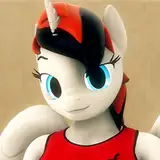
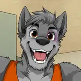
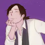
En este caso, la toma que salió de la cámara es la foto en color, y la foto que subí a instagram es la que uso de portada (la cuadrada).
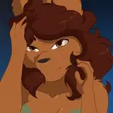
La idea era empastar el negro de la camiseta con el fondo, por eso le pedí a delaia que levantara el brazo derecho (el que está a la izquierda), y dejara en "jarras" el izquierdo.
De esta manera la piel de su brazo no molestaría a la parte negra de la camiseta devolviendo luz reflejada en el y el derecho encerraría la parte blanca, rellenando la toma.
Pero cuando lo ví en la pantalla del ordenador, aunque estaba bien de luz, el color me sobraba, así que decidí pasarla a blanco y negro. pero pese a que la tripita me encantaba como había salido, las piernas me parecía que llamaban mucho la atención, así que decidí quitarlas de la ecuación, y eso me llevó a hacer lo mismo con el brazo.
En ese momento tenía otro problema, y es que aunque suelo "encajar" a las modelos en la foto (como la segunda imagen), lo hago siempre por igual en todos los lados, pero ahora me sobraba aire y no podía encajarla en el formato tradicional, así que decidí expandir el lienzo hasta hacerle cuadrado, y por fin encontré la foto que me gustaba.
¿Cuál os gusta más a vosotros?
================================================================
Sometimes I like to share the creative process with you, so you can see the way I work.
In this case, the shot that came from the camera is the color photo, and the photo that I uploaded to instagram is the one that I use as the cover (the square one).
The idea was to paste the black of the shirt with the bottom, so I asked Delaia to raise her right arm (the one on the left), and leave the left in "jugs".
In this way, the skin on his arm would not bother the black part of the shirt, returning light reflected on it, and the right side would enclose the white part, filling the shot.
But when I saw it on the computer screen, although it was well lit, I had plenty of color, so I decided to turn it to black and white. But despite the fact that the tummy I loved how it had come out, the legs seemed to me that they attracted a lot of attention, so I decided to remove them from the equation, and that led me to do the same with my arm.
At that time I had another problem, and that is that although I usually "fit" the models in the photo (like the second image), I always do it the same on all sides, but now I had alot of air and I could not fit into the format traditional, so I decided to expand the canvas to make it square, and I finally found the photo that I liked.
Which do you like best?