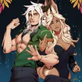
I've been obsessed with this type of color palette for a long time and have no idea how to create them without eyedropping everything.😭 Turns out its all gradient mapping.
But there are some challenges with gradient mapping too, I tends to get a flat/mono-tone result to my work (you can probably see that in my 2 recent posts.) Until I realised that these color are meant to be the base building block and not just a finishing filter.
By adding a pop of saturated red in the fruits and cherries, it adds so much depth into the overall look of the work. Its such a simple step but because I was restricting myself to certain way of doing thing, it just did not occur to me that I can introduce new color into the piece and not having to stick to the color set.
I took some notes of the basic idea for gradient mapping and the set that I'm working with in case you would like to test it out yourself!
cole
2023-03-28 02:39:09 +0000 UTCnoah
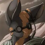
2023-03-28 02:33:06 +0000 UTCPrimmoth
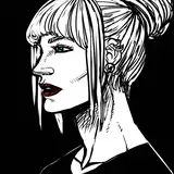
2023-03-28 02:21:48 +0000 UTCAméloche
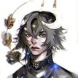
2023-03-27 20:05:29 +0000 UTCLucian Pérez
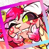
2023-03-27 18:20:29 +0000 UTCaarriiccaa
2023-03-27 18:01:29 +0000 UTC