Thank you for your support! (^^)!
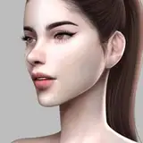
This is a situation of footjob from toe licking.
It was in a classroom, so I tried to create an after-school atmosphere.
<Next notice
Undecided
<Requests for this month
https://docs.google.com/spreadsheets/d/1TJJNUsz-znBH5e8W0sDAlWTz-l-C1iRlNnNTfPuYSGc/edit?usp=sharing
Marshmallow. If you would like to anonymously send us your comments and requests, please click here.
https://marshmallow-qa.com/botan_emu?utm_medium=url_text&utm_source=promotion
Discord. It's like a message board where you can comment casually. (You can just look at it)
This is an invitation code for Discord.
Goods and back numbers are on sale.
(Back issues are also available at Ci-en and Fantia)
I am writing essay-like articles (currently I write mainly on Discord, so I have been neglecting it).
Here is a list of original characters I have created.
https://ci-en.dlsite.com/creator/384/article/354578
I think I have completed something close to my ideal for this illustration.
In the past, I have sometimes over-lit them or made them too dark and plain, but this time I think I got it just right.
It is also important to choose the right place to shine the light, and it is not enough to just shine the light. The purpose of lighting is to lead the viewer's eyes to where I want to show them.
It may just be that I like the picture, but when I look at the pictures of people I think are good, that is how I see them.
To be precise, it is not so much the light that is important, but the contrast. The human eye tends to focus on areas where the difference is clear, in other words, where there is a strong contrast. Conversely, this is also true when shadows are placed in bright areas. If a fair-skinned character wears black clothes, this also creates a strong contrast.
The advantage of using light to guide the viewer's gaze is that there is no need to draw in areas you don't want to show.
Since the eye goes to the place where it is guided, there is no need to draw much in other places. So I can spend more time on the areas I want to draw and draw them faster.
In other words, the white areas of a picture are whitewashed and blacked out. Areas with strong light become pure white, and dark areas are blacked out.
I think the actual human eye is the same way. When you are looking at a bright place, you cannot see the dark place very well, and when you are looking at a dark place, you cannot see the bright place because of glare.
If you want to reproduce this in an illustration, it would be more realistic if you don't draw too much. It is just right that there is something drawn, like a chair or a blackboard, but you can't see it well.
In this illustration, the bright areas are blown out and the dark areas are shown. However, I wanted to show the soles of the feet and the face, so the uniform is rather blacked out, and the hair is painted simply. If I painted too much detail, the eye would be drawn to it.
Also, the lighting is not as accurate as I would like it to be.
I sometimes look at it afterwards and think that shadows cannot be created here, but it is a production-oriented approach (although there are times when I am really wrong).
For example, in this illustration, I think it is normal for the light to be on the right side, and looking at the way the person is lit, I think it is correct that the light on the wall is more to the right.
But I did not put light on the right side because I did not want to show the right side.
The human eye goes to the border area of contrast. In other words, we don't want to show the right side or the left side as far as the background is concerned, so the right side is blacked out and the left side is white. The center of the boundary area should be described properly as much as possible. The floor should look like a wooden plank.
I think this is the best way to do it.
I have been struggling for the past year or so because I didn't know how to use light.
Should I draw realistically and accurately, or should I just make the light look cool?
No matter how hard I try to draw, I end up with a picture that doesn't look coherent. Maybe someone who is very good can draw a cool picture even if they use light in an appropriate way. I don't have a good sense of style.
So, after thinking about it and studying the paintings of good artists, I thought it might be a matter of guiding the viewer's line of sight.
I had always known that guiding the viewer's gaze was important, but I had neglected it.
I thought that guiding the viewer's gaze was only a supplement, and that the important thing was to draw well (of course, it is important to draw well, but it is more important than that).
In my opinion, there are many people overseas who are able to create cool light eye guidance. Especially in Korea and China.
I don't see many Japanese who can do it. They are good, but many of their pictures are not coherent, with light shining here and there. Recently, illustrations from Korea and China are gaining recognition, and more and more people are copying them, but I don't see many people who can do it properly.
However, it may be difficult to use this light-based eye guidance for sexually explicit illustrations. In fact, I have not seen many people who have done it properly in sexually explicit illustrations.
But I like this use of light and feel it has potential. And the fact that no one else is doing it yet means that there is a possibility to become a leading artist.