This is another page where absolutely nothing remains of the old one. It's all new, fully remade. There was nothing worth saving on the old one... It's not a page I remembered being bad, mostly because it's not a page I remembered at all.
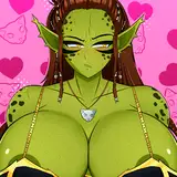
So what changed ? Nothing much, it's just better drawn really. But some details matter I think. I added some little sweat drops cos they're supposed to have just come out of multiple intense buttcoitus. We see Zee's butt better in panel 1 because Zee has a nice ass and I thought it was worthwhile to show that out once more.
In the old panel 2, I wanted Larsen to seem like he was rubbing his head against Zee's sensually but it didn't really came through. I don't know if it comes through much better in the new panel 2 but I tried, added a bt of puffy cheek to Zee and put their head to the same level instead of one in front of the other.
Between then and now, one thing that changed a lot with my art is that I tried to add full-body scenes to my pages a lot more often. In fact most pages I draw have at least one of them. In the old panel 3, it was almost fullbody but not quite, and it looked cramped. So I rectified that, along with Larsen's face in particular. I don't know how much it shows on the old panel 3 but zooming in, Larsen's face is just terrifying there.
It's hardly better in old panel 4 tho. It's again something I tried to rectify with my art since, not giving my character massive fucking peepers. The fact that this is better in new panel 4 might help you forget that I didn't draw Zee's strand hair that usually stick out !
RodVonBoche
2019-07-08 00:54:06 +0000 UTCRodVonBoche
2019-07-08 00:49:39 +0000 UTCRodVonBoche
2019-07-08 00:46:58 +0000 UTCmatt
2019-07-04 21:28:51 +0000 UTCEldkatten
2019-07-04 05:40:24 +0000 UTC


![さとと [satoto]](https://xaiju.com/istorage/108048.jpg)