20a is more vibrant and colorful I like that more :) Though maybe you could provide both since that might be more to the liking of some :) and both images are made during your process :)
Vela Nanashi
2016-03-22 21:58:46 +0000 UTC
I vote for the 20a Version.
Woodman
2016-03-22 21:43:08 +0000 UTC
C version
jfl
2016-03-22 20:52:07 +0000 UTC
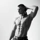
I like 20a better, even though 20a_c is probably more realistic for a dungeon lit by candles
Magnus Carolinus
2016-03-22 19:29:48 +0000 UTC
The lighter one would be my favourite. Better skin tones and colours imo. :-)
X3Z Fan
2016-03-22 18:50:44 +0000 UTC
I vote for post-processed. To me, it looks more colorful, vivid, and cleaner in contrast.
Vernacular
2016-03-22 18:25:58 +0000 UTC
The highlights make the scene, I like your post work.
Planetfall
2016-03-22 17:38:16 +0000 UTC
20a. More dynamic while other seems flat. And I love the pose/angle. Puts the viewer in her place without the POV.
Hammer
2016-03-22 17:29:58 +0000 UTC
20a give me those rim light and high reflections - brings it to life! Great pose too!
3Dzen
2016-03-22 16:40:50 +0000 UTC
That's a tough call. They equally look fantastic, but I think I'll vote for Post Processed, as this seems to have the more natural lighting, considering it's in a dungeon scenario.
Clu
2016-03-22 16:32:07 +0000 UTC
20a is better than 20a c imo, from a visual point of view. 20a c may fit the dank dungeon setting better, but isn't as nice to look at.
Jake theberge
2016-03-22 16:29:21 +0000 UTC
АААА! Светлый всё равно приятнее!!!
M
2016-03-22 16:26:35 +0000 UTC
ну-у блюр и за ним шарп, они же детали стирают в такой комбинации, хотя может такой эффект и нужен
M
2016-03-22 16:23:10 +0000 UTC
Вот и я хз. Единственное, там больше чем просто коррекция гаммы. Целый комплекс эффектов, не говоря уже что пред ним я изображения собираю по пассам с применением сначала блюра, а затем шарпа, по киношному.) А иногда сами пассы редактирую, если в них что то не нравится.
X3Z
2016-03-22 16:12:34 +0000 UTC
Думаю все же темное изображение больше поддерживает атмосферу данжа
M
2016-03-22 16:11:28 +0000 UTC
Гамма коррекция? Правая часть выглядит приятнее, а левая реалистичней. Что лучше? х.з.
пы сы Думаю все же темное изображение больше поддерживает атмосферу данжа.
пы сы 2 А вот светлое больше для романтических сцен подходит, там заметна засветка ярких областей, для данжа как-то не очень.
M
2016-03-22 16:09:37 +0000 UTC
Well, i do all my stills with(for) post processing in mind, aka lighting effects.
X3Z
2016-03-22 16:08:04 +0000 UTC
What do you mean? With or without lighting effects?