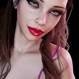
There’s been requests for explaining how I do my skin coloring, so I tried breaking down my current technique showing the full process as well as showcasing the different brushes I’m using to add shadows, texture and color while also explaining the order of things I’m doing it all in.
As a little disclaimer I do wanna say that this is nothing set in stone and mostly meant as a general introduction to my current way of rendering skin from start to finish. I am mentioning things that might be confusing for people not familiar with digital drawing or who are just starting out, so please bear with me while I try to make it as coherent as I can without completely overstaying my welcome in my silly little presentation here.
There’s been recurring techniques and methods I’ve been establishing for quite a while but some steps I only recently added. “Style” aka technique tends to be a very fluid ever-evolving creature that’s always influenced by personal development of skills, learning new methods through other artists and their art and simply playing around with features my current drawing equipment or new brushes are providing.
Adding to that, each step could be its own thing, so if anything within this process interests you in particular, just let me know and I can go into even more detail in another post 👍
For technicals:
I’m working with Clip Studio Paint Pro and a drawing display (Huion Kamvas 22). I am afraid that all the names and settings are in German (because you cannot just change the base language of the program without a full reinstall as I learned?), so I’ll be trying my best to translate everything to their English counterparts at least down here. The settings within the program should be identical if someone wants to copy that, though, so I added a visual setting guide for the different brushes as well (mind you brush size is always relative to whatever canvas you’re working on, so really the only settings that are interesting are for opacity, mode and harshness.)
Right now I am using a variety of free basic brushes and some custom brushes I downloaded/purchased.
The general order of things is as followed:
1) Base layer: Flat Marker (CSP Standard Brush)
2) Harsh Shadow: Flat Marker/Air Brush (CSP Standard Brush)
3) Soft Shadow: Air Brush (CSP Standard Brush)
4) Skin Texture: DAUB Brush | Old School Chalk (purchased on https://www.daub-brushes.com/csp/#dry_media)
5) Light: Air Brush/Flat Marker (CSP Standard Brush)
6) Details: Artemus Hard (free on CSP Assets; Content ID:1758182)
Harsh Shadow
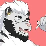
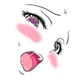
After I put down a base color the first thing I like to do is add the most prominent shadow layer, the harsh shadow. It’s the most basic shadow layer to define the light source and intensity of the shadow areas. It defines the nature of the light source, a time of day or really just the intensity of light and dark. In this instance I am working with a rather sharp light source from above, so I’m going with a darker shadow color as a base.
When it comes to the big “how”, I am following a base formula for shadows that works with the concept of contrasts and bounce light to create lively texturing and rendering:
I could make a whole post on this concept alone, but generally speaking there’s two big ways you can accomplish a contrast: Hue and Sharpness. Sometimes it’s less about going darker or lighter with a contrasting color but how sharp the edges are between the two colors in question. You can see me apply this technique on the soft shadow layer at several points to emphasize the creases and edges on Astarions face even if the shadow color isn’t made any darker or intense.
Bounce Light means that the darkest color of a shadow area usually lies right at the edge (Core Shadow) between two planes where the light stops and the shadow begins, getting softer and lighter towards the outer edge because light is being reflected back to the surface. This light usually carries some color of the surrounding area, which would be cooler toned in a neutral lighting. This rule really helps to make shadows more dynamic and less flat appearing, which is what I’m currently preferring for my rendering. To emphasize this even more, I usually apply said cooler tones at the outer edge and warmer color at the inner edge with the help of an overlay on another layer. If my background has his own color, I try adding some of that as well. In this instance though I can get away with focussing on just warm and cold tones.
As with most things, less is more usually, so I try to keep the effects to their least amount of necessity (although I wouldn’t say I’m always succeeding because sometimes more is just more fun, like for the red tips of ears :D).
In short:
Add Base Color (Flat Marker)
Softly erase around the outer edges (Airbrush) to simulate “bounce light” and better define the core shadow.
Add a separate layer as an overlay with varying colors depending on the surroundings.
Clip Studio and other programs offer a nice setting that makes layers interact with each other in a way that the only parts where color shows up on the top layer is in correlation to where you applied color on the bottom layer (clipping masks). The thing to take away here is that the color on my layer I put on top of my base (shadow) layer is only showing up where I drew on the base layer, taking into account any and all transparency and texturing already present there.
This way I can be pretty willy-nilly with my Airbrush when adding the coloration to a shadow layer, leaving room for future adjustments. (It’s certainly one of the things I could go into more detail in another post). I pretty much use this on any shadow layer to add more darkness and/or color, sometimes right away, sometimes down the line.
Soft Shadow
The soft shadow layer is really my personal favorite because it’s where I’m defining the face and its features the most. To give myself less of a hard time I am mostly using the Airbrush to slowly build up shapes, going back and forth until I’m getting the features defined in a way I’m looking for. The soft shadow color is mostly a less intense but warmer sister to my harsh shadow color to keep things coherent but also really keep the harsh shadow the star of the show when it comes to defining light and darkness. The soft shadow is for additional sculpting, hence why it comes after the harsh shadow layer in the process while being placed underneath in the order of layers.
To really make areas pop I am going in and erasing parts back to the base color, most present around the eye, nose and mouth. Depending on the cheekbones that’s usually also somewhere where I like to cut the crease sharper to make the shadow appear stronger without adding any more color and tends to be a feature quite present in most of my drawings. With how Astarions face is angled, he has sharper lines around his smile lines since the cheek and jaw are highlighted a lot by the light source.
Skin Texture
This is one of my newest additions to the process. It’s really mostly meant to just add texture and some varying coloration, which is why I’m using a heavily textured brush big in size but low in opacity. It just adds that little bit of blemished touch I suppose.
Light
There sometimes is a counter layer to my soft shadow layer that’s pretty much adding some more definition through lighting. I try to not get too heavy handed with this one, which is why I’m sometimes skipping it altogether because it really can make the face appear too sharp. When it’s in action I mostly apply some highlights to the cheeks, around the eye sockets and, depending on the lighting, in the inner corner of the eyes. It’s meant to literally highlight the most prominent features as well as making the skin more “juicy”.
-
Details:
This is really the last step that’s sometimes also sprinkled throughout ;) It’s pretty much the part in the process where I go in all over the place to add in more coloration, define features or simply add on here and there to bring out what I want to see emphasized even more. I listed the pencil brush but it’s also done with the Airbrush and Marker Brush depending on the area.
It’s also important to note that I’m always having an overlay layer at the top of my drawing that’s texturized, which makes any and all colors appear textured.
-
The combination of all of those steps make up what is my current process for rendering skin. I hope it’s at least somewhat understandable what I’m doing from me explaining a little. For everything else, I hope the added images and clip help to bring sense to my words 🙂
Again, if you have any further questions or would like me to get into more detail for a specific step in the process, just let me know and I’ll try my best to give an explanation on what it is I’m doing!
Skribls
2024-04-23 12:56:24 +0000 UTCRute_Aranwen
2024-04-14 18:46:39 +0000 UTC


![Kem Alkemest [Assetto Corsa Mod]](https://xaiju.com/istorage/14088.jpg)