XaiJu
Princess Weekes
Princess Weekes

patreon


Thumbnail Feedback! (Take 2)

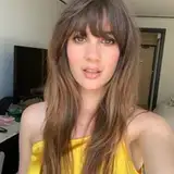
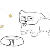
Two thumbnails for upcoming 'smaller-ish' videos and I wanted to get some feedback about what could be done to improve them because I feel like they are missing ... something. 

Thumbnail Feedback! (Take 2) Thumbnail Feedback! (Take 2)

Comments

the second thumbnail, with carmilla is great, no notes from me personally. the slytherin thumbnail needs to be brighten up. the person in the picture needs to be brighten up more to pop. id say the "slytherin" text under them needs to pop as well i cannot really read it

Mizz Mack

The one with Aemond Targaryen is perfect. The green thumbnail for slytherin isn't as good as it is that dark green. The font is harder to read. Maybe zoom in more on the face so it almost fills the oval.

Samantha J

I'm kind of bothered that the upper hearts are cut off in the first one. Also maybe a darker background? The loving evil font is really pretty.

Domenica K

I might like the text centered in the second one though my brain is struggling to find where I'd like the Slytherin crest. The first one though? Flawless, ready to embrace my evil side.

Bex

oh ty for all this Feedback, I don't have photoshop but I should be able to make it work on canvas

Princess Weekes

oh whoops! TYPO caught I wrote it like 1000 times I don't know how I missed it

Princess Weekes

It's Zabini, isn't it?

Eric C

Sorry for the spelling error on his name lol, disrespectful on my part

run_away

Typed a whole thing and Patreon zapped my comment lol. First thumbnail good, brighten and raise contrast on photo guy but that's it, perfect text placement, composition, and hot bishonen. Blaize thumbnail bad. Dark skin on dark background so can't see him, font is too skinny and seriff, crest is floaty. Recommend moving crest behind Blaize so that it's half off the frame as well, light and lower contrast on crest until his face is visibly legible and 'pops' over it. Color adjust his eye white to be whiter/brighter to add contrast to the eye. Different font, drop his last name, justify text left. Good text color and glow. Sorry for the brief phrasing lol, my first comment was a little more smoothly written. Looking forward to both vids : )

run_away

Oooo I really like the top one

Linda Maleh

i love them both!!! 😍

queerly beloved


More Creators