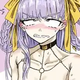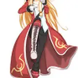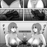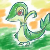
Not sure there's a ton of point posting the inks since they're pretty similar looking to the digital sketch, but eh. If nothing else you can see what I ended up doing with the text. I didn't exactly use any specific suggestion, but took the flavor from a few of them and mixed them together in my own way. I think I got something that fits the tone I want- I hope y'all like it!
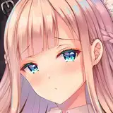
I've noticed lately that the inked version of my pictures have been looking a little disappointing compared to the digital sketch, and I think part of the reason comes down to much bolder lines in the digital sketch. A lot of my pens were too fine. I thought I'd experiment and see how thicker lines look in a painting so I busted out the brush pen for the first time in a while. The brush pen causes some feathering, but I don't think that'll be too noticeable in the finished version, and I do think I'm liking the thicker lines so far.
Anyway, we'll see how it works in the finished thing. I'm off to start painting!
Ruaidri
2020-08-30 06:14:13 +0000 UTCChillum
2020-08-26 18:46:53 +0000 UTCBloudin Ruo
2020-08-26 04:46:35 +0000 UTCRuaidri
2020-08-25 20:20:44 +0000 UTCBloudin Ruo
2020-08-25 20:07:15 +0000 UTC