XaiJu
furlana
furlana

patreon


oh my god you guys

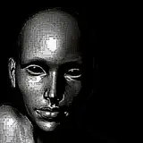
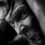
I just discovered a way to make lines pop up more nicely I think! Please take a look at the far left image - it has just standard lines. But the middle one seems to pop up more right? I just did a thing with bluring the lineowrk slightly and i am excited af, becasue it sort of added an automatic slight shadow to the whole image.

And the far right one is taking this even furhter and extending the blur outisde the lines, not only on the inside.

Can anyone tell me which of these You like best? I know the difference is super slight, but I think the middle one wins my heart!

oh my god you guys

Comments

I do color lines very often :) And the higher resolution will be uploaded once the month is over along with all the rest of the arts to my dropbox <3 Thanks a whole lot ! :)

Furlana

The one on the left does seem to blend in better to the whole image. Another thing I see artist do is color the lines to integrate it smoothly in the character they are drawing. Honestly for the middle one I'm not seeing such a huge difference, if you want to play it safe and experiment that could also be a choice. I'd anal-ize the nice bunny lady's buns but the resolution is kinda low:))

this is the one i also went for! :DD thanks a whole lot dear ;w;

Furlana

The art that you placed in the middle, really looks the most pleasant. In General, all types of this art pleasing to the eye - very nice work with shadows and color, but the Central image meets my aesthetic needs. I vote for the middle picture! ^^

First Sputnik


More Creators