This week's theme is "making do with the technology at hand."
I've put the same images in the Patreon Image Viewer (above) as in the body of this post. If you want to be surprised by the "cover" designs, don't read too far. :)
SCANNING
I got out my trusty 13-year-old Canon scanner and discovered it's starting to show its age. Its scans come out with some subtle streaking, dense black spots "bleed" a small amount, and I get a bit of red-blue chromatic abberation (?) around my ink lines.
Wanting to see if I could do better, I borrowed my dad's relatively modern and considerably more expensive Epson flatbed.
I had a brief moment of despair when I made a test scan, opened it in Photoshop, looked carefully at it and thought, "this looks at least as bad as my old scanner!" I wailed into the sky. How would I achieve beautiful, perfect scans? All the technology at hand was failing me.
Then I realized I had opened the wrong file. I was looking at a scan from my own scanner.
The good news: the Epson is streak-free and does not do those chromatic aberrations. The bad news: the Epson makes softer scans than my Canon. It just doesn't look as crisp. I found that I could improve the sharpness by using my scanning software—the really handy VueScan—to increase the amount of "samples." It defaults to 1. 2 looks better, but when I turned it up to 4, the scanner or the software crashed, I don't know which.
Anyway, Chapter Three is scanned now and I'll be spending the rest of the week stitching the scans together and prepping them for lettering.
Last-minute update: the Epson scanner seems to be adding a tenth of a centimetre—but only lengthwise—to every page??? If the scaling were uniform, no big deal. But this is annoying. (Yes, I double-checked to confirm it wasn't more user error.)
COVER DESIGN PROGRESS
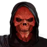
You may recall that I said I was going to work on two covers: SKULLMIST and WINDMILL. These were the roughs I presented…


[ ^ SKULLMIST and WINDMILL roughs, respectively. ]
AND! You may also recall that I wanted to inject more energy into the pose and composition. I did a little sketching on paper and got frustrated about erasing and re-drawing things, since for a cover you want things to look *just right.* So I fired up Procreate, brought in my sketches, and refined them there. (And okay, I'll admit having a swishy iPad at hand is not in the spirit of "making do" with technology.)

After a bunch of fiddling, I thought both the pose and the concept (slashing through the flag) are improvements over my WINDMILL rough.
There was only one problem.
When I started working the actual windmill into the background, I could not find a happy composition.

A problem we had talked about, looking at the roughs, was that the windmill might be too visually complex to sit behind the logotype. I still think I could make that aspect work, but there was a new aspect that bothered me: the windmill kept looking too staid relative to Our Heroine's pose.
I tried different angles, I tried moving things around (yay for working digitally), but nothing gave me any confidence that this idea was worth pursuing. The new pose—my priority—and the windmill were not working together.
While looking up reference imagery for the crashing waves I wanted to splash around Our Heroine, I thought, "what if there's just a big crashing wave behind her?"

And that's how I got to the image above, which I like. It's uncluttered and dynamic. We miss out on the windmill, but I'm not too heartbroken.
While I was in Procreate, I figured I'd test out the colour / lighting concept I had for SKULLMIST.

Yep.
That's what it's supposed to look like.
I also juiced up Our Heroine's pose and added in some more fighting friends.
Back to paper! Because my large-format printer is out of commission (another old Canon product), time to print out my Procreate work onto two small pieces of paper and tape 'em together.

At the risk of making this all about me McGuyvering my way towards finished artwork, I transfer the printouts to my nice drawing paper by holding them both up on the window. I do not have a lightbox.
Then it's time for drawing and inking. You all know how that goes. Here's what the inked pages look like!


I decided to separate the image elements for flexibility reasons. Anything that's not inked will be drawn (or maybe collaged? hmm) digitally.


Got those windmills back in there. :) The big one on the left doesn't live there. It'll get moved over to the right. Again, I was just looking for flexibility.
And that's where we are as of right now!
Here's a fun thing: I ran out of india ink with just enough left to finish that last page.
Now our toddler has woken from his nap and he needs someone to make his stuffed animals pretend to cook pancakes that he can steal. He giggles when the animals get mad about it. I don't love the message of this game, but it's his favourite, topping out classic hits like Run Laps Around The Kitchen and Get Thrown Onto The Couch.
Everyone continue being lovely,
TC
Emma Spronk
2023-03-11 16:26:07 +0000 UTCtom works
2023-03-09 22:35:00 +0000 UTC