Vote: THE PIRATE FLAG (Also: Hoarding Col-erase Pencils)
Added 2023-01-25 19:56:00 +0000 UTC
I am rapidly approaching inking the end of Chapter Three, wherein we see a pirate flag unfurl, but I still haven't chosen a flag to use.
Please help.
Some background: real pirate flags, it turns out, were boring. They're cool and spooky in a realistic sort of way, but not very dramatic. And they're a little on-the-nose with the repeating skull-and-bones motif.

^ From an Osprey reference book.
But! One detail I really liked was the use of the "hourglass" imagery (see 5 and 7 above), apparently used to symbolize the fleeting nature of life.
Wait, do I sound surprised? Because I am not. I had definitely been thinking about that symbology when I included this hourglass on the second page of the book.

^ Anyone who suggests this is a coincidence and that I am making a post hoc rationalization will be summarily keelhauled.
So I started sketching some flags that featured hourglasses. My favourites are…

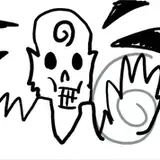
Talon clutching hourglass. I like this because the pirates invade and take hold of Archipoli, so it feels suitable. In the belief system of Her Celestial Majesty, The Swan of the Skies, the concept of death is symbolized by the Black-Winged Kite, here alluded-to with the talons. It's a connection which anyone at the time would have been able to make.

Hourglass with scythe. I like this one because it's balanced, it puts the hourglass front-and-centre, the X shape recalls the skull-and-crossbones shape, and the scythe, well, it's a scythe. We know what scythes mean.
And then, because I like the design, I'm including…

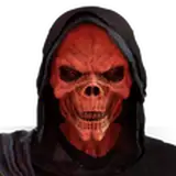
Skull and anchor. This is essentially the design that already appears in the book, both on the little title illustration and on page nine, when Alexandra is imagining pirates. I like it because it looks about as badass as I think I can make a flag look.

I'm having a hard time deciding whether I prefer…
The first two options, where the pirate flag feels "fresh" (distanced from skull-and-bones stuff) with the thematically appropriate use of the hourglass. Plus, it might be weird if Alexandra imagined the actual pirate flag that appears.
OR
The last option, where the flag feels familiarly piratical (hello skully!), which might make a more powerful reveal. Plus, one could argue that when Alexandra imagines the pirate flag on page nine, we're actually cutting away to see the threat as it is.
~
The poll is at the bottom of the post!
Unlike the cover-design vote, you only get one choice! :)
The poll ends on February 10th, just in time for me to actually draw it into the book.
- - - - -
IS PRISMACOLOUR DISCONTINUING THEIR BLUE COL-ERASE PENCILS?
I don't think so, but out of an abundance of caution I ordered what I assume will be a lifetime supply.

Talking to the owner of my favourite tiny local art store, I learned that individual blue Col-Erase pencils might be hard to come by. Apparently Rubbermaid® bought Prismacolor®, and they're going to stop selling individual Col-Erase pencils. They'll only be available in multi-colour sets. That would be bad, because I use a LOT of the blue pencils, and I'm not going to buy multicolour sets just to throw out most of it.
However! I heard a competing rumour that blue and red pencils will still be available individually. Sure enough, if you look at the Prismacolor site, they still offer red and blue for sale individually.
I took this information to my art supply store. The owner confirmed with her supplier, who apparently will not be making red and blue available individually.
So I figured, ahh, however this shakes out, why don't I just go and buy enough blue pencils to get me through at least a few decades of drawing comics on paper.

Local art supply store Opus Art Supplies was perfectly able to send me exactly 69 blue Col-Erase pencils. I don't usually do Jokey Internet Numbers, but this way I got free shipping. If I had ordered 60, I would have had to pay more.
As an aside, this postcard was included in the shipment:

Thank you, Opus staff, I sure as shit WILL have "fun" with my new pencils, ha ha ha, why do I think that is so funny.
Look at the highlights and drop shadow on that "Tony!" These nice people put more care and effort into hand-lettering this postcard than I did on my Christmas cards to people I ostensibly love and care about. Hmm. Time to reevaluate my priorities.
Important note: if you decide to stock up on Prismacolor pencils just in case, maybe do not order on Amazon, if for no other reason than I saw a lot of reviews saying, "this listing says it's for a dozen, but the seller sent me one individual pencil." Yikes.
- - - - -
I'll share more Chapter Three inks next week, but here's a little highlight I liked too much to keep cooped-up.


^ Alexandra and Katerina really enjoying the best of what polite society has to offer.
What else is coming up?
- Gotta look at the results of that cover-design vote!
- A look at writing dialogue!
- And, of course, much more inked artwork.
Everybody stay super lovely out there,
TC
Comments
Knife-toed murderfeet!
Tealin
2023-02-02 17:55:35 +0000 UTCJFC I just watched that video and now I know how that old-timey audience felt watching the film of the train coming at them
Tony Cliff
2023-01-30 23:41:49 +0000 UTCHa ha ha ha ha, she's so observant. :)
Tony Cliff
2023-01-30 23:40:31 +0000 UTCHaaaa ha ha ha ha ha ha ha ahhhh you’re the best.
Tony Cliff
2023-01-26 16:32:18 +0000 UTCI'm solid on the skull & anchor – it's piratey AND creepy AND metal AF. But if you do decide to go for the talons (I like the symbolism but is it too much to explain?) then do please make the talons look actually deadly instead of like cartoon bumbly-bird stuffed-glove-foot-hands. They're for impaling hapless victims, not giving a massage! https://www.youtube.com/watch?v=SAz1L8DlvBM
Tealin
2023-01-26 16:18:06 +0000 UTCI like them all - though I prefer B over A, and B is easier to parse at a distance than C. Plus the option of Alexandra being all, "what, no skull? No bones?"
Kathleen B
2023-01-26 01:48:29 +0000 UTCSkull and Anchor gets my vote just; it's a great design and feels the most pirate-y. If there was a way to integrate the hourglass with the skull/bones/anchor that would get my vote because, I do like the symbolism of the hourglass.
skyyefall
2023-01-25 20:25:18 +0000 UTCThere's something about the skull and anchor that feels eerier to me, maybe because it's more detailed than the other two? I think I'd like A more if the talon were sinewy and sharp-looking (and maybe clutching from above). Of course, there's always the option of hourglass + bones, why not both?
Claire Bendix
2023-01-25 20:18:59 +0000 UTCRubbermaid?? Fascinating. I still have reds and blues from my last stock up (including some non-photo blues that I work a little Too well)! As for the poll, I'm way more interested in the hourglass motifs, over the common skull 'n' crossbones. Of course the bones are more menacing, but it's what I expect, so it doesn't capture my wonder as much.
Abrian Curington
2023-01-25 20:12:37 +0000 UTCNot motivated by any particular supplier shortage, but I *still* have a giant stash of blue colerase pencils from when I stocked up at Portland's I've Been Framed (a very eccentric local store) in 20...11? Maybe? I'd asked them to order me some, and when they called to tell me the order had come in I arrived to find the owner holding a full-on Santa Sack crammed to the brim. I selected a modest amount and they charged me something absurdly affordable like .10 a pencil and then I left. The end.
Lucy Bellwood
2023-01-25 20:10:14 +0000 UTC