Easy Ways to Make a Comic Better*
Added 2022-12-01 19:34:01 +0000 UTCFriends, please let me share some simple checklist ways to help a comic look as good as it can. These items are low-hanging fruit, little quality niblets ready to be snatched up, free points to be scored, and they're all mistakes I've made in the past. I offer them in a spirit of comradeship, locking my arms with yours as we share this strange, specific creative pursuit and its oscillating joys and miseries (but also in the very selfish spirit of never wanting to see another balloon tangent ever again).
If you are a reader, a librarian, and/or a reviewer, I invite you to enjoy this post like, “here are some basic elements of craft that you should expect from a comic book or graphic novel.” I'm tempted to call them "table stakes," but maybe that's harsh.
If you are an editor of graphic novels and comic books, please encourage your authors and artists to revise these issues. This is a purely selfish request, asking as a reader of comics.
If you are a comics artist, please accept these as things to keep in mind when you are pursuing your craft of comics-making. I try to keep them in mind, myself. The world thanks you for putting care into your work and for respecting your readers as well as the materials that have been used to produce the finished product (i.e., the trees they chopped down to publish your book of fart memes).
These are all relatively style-agnostic issues, I think. Whether you’re making the most traditional, olde-timiest comic Prince Valiant has ever seen or whether you’re blowing minds with your thrilling disregard of print resolution concerns, these notes apply. Whether you’re making manga or Western-style comics, short-run zines or the next industry-shaping Scholastic series, these ideas probably apply.
- - - - - - - - - - - -

BALLOON TANGENTS
What this is: word balloons positioned within a panel so that the outline of the balloon coincides with other lines, butting up against the edge of other balloons or the panel border.
Why it sucks: tangents of any sort create visual friction; they are irritating to look at because our brain doesn’t know how to parse the imagery. Is this line part of that shape? Or part of that other shape? They’re not actually painful to look at, except wait no they are painful to look at.
How to fix it: move your balloon(s) so the lines are no longer coincident. If you're working digitally, this might be easy. If your balloons are baked into the artwork, it's worth it to spend some time editing this issue away.

CROSSED BALLOON TAILS
What this is: in order to point to their respective speakers, the tails of different word balloons cross over each other. Like, Jim is on the left and Debra is on the right, but Debra’s dialogue balloon is on the left and Jim’s is on the right, so in order to point to the right person, the tail of each balloon has to cross over the tail of the other.
Why it sucks: during the middle of your emotionally-charged scene, where Jim and Debra’s love comes to full bloom, you’re asking me to play a child’s game of “Connect the Dialogue to the Speaker.” It's extra mental work, it's a pothole in the otherwise smooth road of the reading experience.
How to fix it: okay, admittedly this is not an easy fix, so please try to avoid this problem at an early stage. You can't simply shorten the tails so that they're no longer crossing, because the crossing tails isn't the problem in and of itself. The problem is that the relationship between balloon and speaker is non-obvious.
Consider moving some dialogue to neighbouring panels.
Flop (mirror) the artwork to change Jim and Debra’s places, if possible.
Re-draw the panel to put Jim and Debra in a better position relative to their dialogue.

PERHAPS-INADVERTENTLY REPEATING PANELS
What this is: one of my own worst offences. On one page, you have a panel of someone’s face at a certain angle. Flip the page, and at a similar place on the new page, there’s a similar drawing of the same character. I do this when I’m tired or running on autopilot; I try to correct it before pencilling. Depending on the style of the comic, this may or may not be an issue. For example, if you’re drawing GARFIELD, this is (as they say in game development) a feature, not a bug.
Why it sucks: it creates a “deja-vu” effect and looks lazy. It is visually uninteresting (again, unless it’s part of the intended effect).
How to fix it: just re-draw one of those panels, Tony. You think I’m not paying attention? You think you can get away with this?

BAD LETTERFORMS
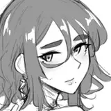
What this is: this shows up most often when someone has created a digital typeface out of handwritten letterforms. Handwritten type has a pleasing organic quality to it. When you scan that, though, and turn those letterforms into digital font glyphs, you see (for example) the same “e” repeated over and over, or the same “n” or “m.” If the original type is loose, these letterforms can look especially bad when repeated in the manner of a digital typeface.
In the example above-right, look at the letter "A" in "EATER." It doesn't sit well. Look at the letters "R" and "B," too, and how obvious their repetition is. (Admittedly, I have not provided a bulletproof example here, because my lettering skills are poor; I'll admit it's a toss-up which option looks better.)
Why it sucks: there is something uniquely terrible-looking about seeing loose hand-lettering shoved through the meat grinder of a digital typeface. Distinct-looking letterforms lose their magic when they’re replicated and repeated with digital precision.
How to fix it: If you must letter digitally, use a professionally-developed comics-lettering typeface. Find one that suits the feel of the artwork and the tone of the story, then just use that.
Consider finely-honing your digital typeface: tame the handwritten letterforms so that they are more compatible with the strict regularity of digital typesetting.
Consider using advanced options to alternate glyphs and ligatures in your custom typeface: maybe there are three different versions of your lowercase “e” that are either used randomly or can be chosen by your designer.
Finally, consider hand-lettering the whole comic.

POOR FONT CHOICE
What this is: you want to use Verdana for your dialogue text? Really?
Why it sucks: some fonts are poor choices because they’re overly familiar. If it looks like something your aunt Mildred would use on a poster advertising her garage sale, it’s not the right choice for your comic book (again–again!–unless this is your artistic intention). A good rule of thumb is to never use any font that came installed on your computer (except Helvetica).
Some fonts are poor choices because the typeface is just… not… good. Maybe it was the type designer’s first font. Maybe it’s just not very sophisticated, and the letterforms are basic or the kerning is poorly-considered. Maybe they’ve done a rush job converting handwriting to a typeface or… or maybe it was just some handwriting uploaded to a website where software ostensibly converts that text to a typeface.
How to fix it: when you are choosing a font, think about it like choosing a collaborator. The type designer who designed the typeface is now working with you on your book, except from a distance both in space and time (ooh!). Take your time. Be thoughtful. Consider lots of options and print out different examples. And don’t use any font that came installed on your computer.

NON-PROPORTIONALLY SCALED TEXT
What this is: someone has decided that “this block of text is too long” and so has scaled it down… but only along the horizontal axis. This is a typographic crime.
Why it sucks: like the issue with letterforms, consider your typography as the work of a collaborator. The type designer has spent a long (long!) time carefully engineering their typeface to look good just as it is. By scaling that text non-proportionally (i.e., you scale it along one axis more than on the other), you’re ruining the shape of the letterforms. Put more simply, it looks like uncle Doug has been let loose in Broderbund Print Shop.
How to fix it: if you encounter an area where (for example) you wish your letterforms were narrower, choose a narrower typeface. Many professional-grade typefaces come in different widths (if you’re using “Gotham Book,” look for “Gotham Book Condensed”). If you’re lettering manga translated to English (where this can often be an issue), I think there are some comic-looking typefaces designed in condensed widths. Look for them!

WONKY PERSPECTIVE
What this is: lack of attention, discipline, or practice with regard to drawing three-dimensional objects in a three-dimensional space. For example, the desk in an office looks like it is tilted at a weird angle.
Why it sucks: you’re asking your reader to generate belief in characters and worlds that exist only as a thin layer of ink on paper. When all the visual cues in a given image combine to create the effect of a believable 3D space except, say, for the courthouse columns which meet the ground at an angle that suggests that the ground exists impossibly on two different planes, it’s visual friction. You ruin believability.
How to fix it: look, I know perspective is hard. This is not an "easy" "tip." Sorry.
But good news: perspective is not mandatory! You don’t need to use traditional 3D perspective! Consider employing a medieval-style flat perspective (go look at a tapestry and take notes). Do something weird and graphic. All I ask is that you follow an approach with enough consistency that it looks like whatever you’re doing, you’re doing it on purpose. Remember: you won't be there to tell your reader "I did that on purpose"—it has to look that way.
If you are employing perspective traditionally but are not confident in your skills, consider building 3D models and using them as reference for your “shots,” or even tracing over them (this is less ideal, since tracing over reference imagery often produces lifeless-looking artwork).
As exercises to build your perspective-drawing muscles, go draw scenery from life (employing perspective techniques as you do). Consider drawing perspective lines over top of photographs and see what you learn.
Editors: I’m not asking you to become fully proficient in perspective drawing. It’s okay to just say “the angles look weird here” or “something doesn’t look quite right with this environment.” You’re working with a professional, they’ll know what to do.
- - - - - - - - - - - -
There are other ideas worth considering along these lines, but I'm not sure they're as universally applicable as the points above. For example, I'm not a big fan of ruled lines or their digital equivalent, because I feel like they look "dead"—but that's a style issue; some people make it work for them. "Check Your Spelling" is so broadly obvious that it doesn't fit here. "Draw horses better" is not universally appropriate and again, if the badly-drawn horses feel like they are consistent with the rest of the art, I don't see this as a problem—unity triumphs over any specific idea of what is good and bad. "Write a Decent Story" is a whole other scope. "Make it Funny" is a matter of taste. But balloon tangents are a killer at any time, in any place.
For more nitty-gritty on balloon shapes, see this post, which Lucy Bellwood sent me (Hi Lucy!). Note the recurring theme of "reduce visual friction for your readers." Lucy also reminded me about Nate Piekos' Better Letterer sheets. The typeface I use for DD and for PRACTICAL DEFENCE is a Nate Piekos typeface; one day I'd like to hire him to create an updated version (the current version is a bit limited, e.g. it doesn't have European characters).
What craft mis-step bothers you when you see it on the comic page? Can you think of a detail or mistake that pulls you out of the book? Let me know!
I look forward to your comics! Be kind to your letterforms. :)
TC
* I am slightly ashamed of this irresponsibly clickbaity title.