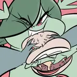
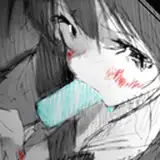
Chapter One is all lettered-up, and I've shared three of my favourite pages above. I'll share a lot more as I move into colouring. In the meantime, some notes:
Literary References
Prior to lettering the first page above, the Captain and his ship did not have names. I do this all the time—I use placeholder names until the absolute last minute. The ship's captain is simply "Captain," DD's mom is simply "Mom," etc. The only one who gets called by her name is DD, and (spoiler alert) in this story, that isn't even her name.
I could make up some excuses about how this is beneficial, like "I do it so that I get to know the character before having to decide their name" but that's not wholly true. Mostly, I do it so I can get going on the more important things. And I hate having to decide names.
So when I was lettering the page wherein the captain introduces himself, I had to come up with a name. One of my favourite books of writing advice is THE ART OF DRAMATIC WRITING (by Lajos Egri), which emphasizes the importance of making every word count. Everything should have meaning, everything should tie together. Ostensibly, that includes the names of auxiliary characters and their sailing ships.
Since I am a dedicated, professional writer, here is what I did: I thought about the captain and his relationship to his ship, and decided I would give him the name of a notable bad father. I opened my browser and put this in the search field: "shitty fathers from literature."
Calvin and Hobbes are both named after philosophers, so I'm following in good footsteps here.
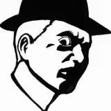
That's why the captain is now Captain Lear and his ship is the Cordelia, both named after characters in Shakespeare's KING LEAR. Based on some quick reading, Lear only listens to flattery and pandering words, and that seems to tie in well with the captain's character.
Afterward, I messaged friend and colleague Dylan Meconis to ask, "is this reference too on-the-nose?"
She replied, "Tony… Tony, is this a book for children?"
Point taken.
(As I mentioned on Twitter, this is not to say that children do not deserve KING LEAR references in their books, only that being Too Precious about it is maybe overkill and that, as I so often do, I have neglected to keep my intended target audience foremost in my mind.)
Other Naming Challenges
Long ago, I came up with a name for Delilah's mother. I must have. It seems like something I would have done for DD2, which heavily features Delilah's mother.
For the time being, though, I was calling her "Mariela." When I got to lettering these pages, I wasn't sure whether that was actually her name, and regardless: "Mariela" is not a Greek name. Thinking, "I'll bet we never learned her name in DD2," I assumed I was safe coming up with a name for her. Once more, I turned to my browser and hit up some Greek baby names (again, I am a professional). After a little research, I settled on "Sophia," a nice Greek name that I think suits her character.
But wait—did we ever learn her name in DD2? Thinking back, I was confident it never showed up in the text. DD wouldn't have called her mother by her first name. She just gets called "mom."
Still, I kicked myself: "Tony, you have to go comb through your old files to see if you'd used her name before. Please demonstrate a little professional diligence."
So I loaded up my old DD2 Scrivener project. Fortunately, because I know myself, I had made a project entry called "NAMES." Sure enough, I had done this work before.
Turns out, mom's name was "Sophia."
I laughed to myself, saved the lettered page, and closed it.
The joke is on me, though. Now I have to scour DD2 to see if I didn't change her name on a whim while I was lettering.
Lettering Details
I'm really happy with this split-panel balloon effect, where the balloon opens up to the gutters. I saw in a Lucky Luke comic, and now I'm trying to sneak it in wherever I can.

Shouty-looking text is difficult. The worst solution is to simply scale up the dialogue typeface, so I don't do that. The best solution would be to mimic the dialogue typeface with my own hand-drawn lettering, but when I do that, I always feel like it doesn't quite look right. So I'll be lettering big shouty bits like this, with a style of lettering that comes naturally to me, but which isn't perfectly matched to the dialogue typeface.

That dialogue typeface is Nate Piekos'/Blambot.com's MIGHTY ZEO 2.0. I have tried a number of dialogue typefaces over the years, and I keep coming back to this one. I can't articulate exactly why. It's the only one that "sits right" with my drawings. That's all I know. I keep trying alternatives and Mighty Zeo keeps being the only one that makes me happy. It's a shame, because it's not the most refined typeface. It is, however, the best typeface (for this comic).
What's Next?
Next up, I have to create colour designs for the characters. Gotta establish those, so I can keep things consistent.
Then, I'm going to create colour keys. I'll take a key panel from each scene and make basic colour choices about it. This is handy for planning how one sequence looks next to another. Just like a video game has to have a jungle level, a fire level, and an ice level, it's important to have variety. But you also want everything to feel cohesive, and colour keys help achieve that.
After that, I'll start prepping the pages for colour (or "flatting" them). This is the digital equivalent of, say, using masking fluid for a watercolour painting. You mask off different elements of the imagery so it's easier to go in and slap down some colour.
And then, of course, it's time to start slapping! Colour, that is. Onto the page.
Tony Cliff
2021-06-23 16:37:59 +0000 UTCBrian Harold Taylor
2021-06-22 16:57:03 +0000 UTCkaitou
2021-06-10 15:19:31 +0000 UTC