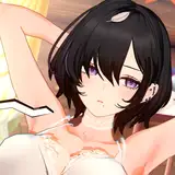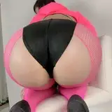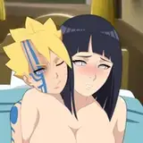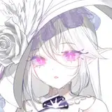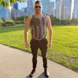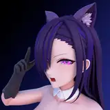
Finished this up right before class! The first thing to point out of this really is the first picture of Gogo. I forgotten something so basic which was to flip the image to refresh my eyes and from the WIP, i was dissapointed with the shape and position of her eyes as well as her hair shape. What really bothered me was that i was already far into the rendering stage as well x) so i did what i usually do when this happens and just copy merged the group layers to free form it so you'll definitely see a definitive difference from the WIP of her expression. the second picture of gogo, i did a simple change which was just removing her grit teeth and hide it under the arms to make it look like she's kind of muzzled up like a dog. and third picture, i left it as it is. As for her color scheme from the last gogo picture i made, i wasn't too fond with the level of saturations on certain aspects of her scheme from the last one so i tried bumping up the saturation of her jacket and darkened her hair a bit to be closer to black but not pure black. Removed her leggings because i just personally love seeing bare legs *w* Onto the subject of the man, i was far more satisfied with my rendering here when it came to the forearm muscles since i haven't really tackled that directly. And i know it's not perfect or ever will be perfect but it's a great stepping stone in my opinion to having some sort of background knowledge when imagining the shape of the forearm now.
As for the body hair, instead of long strokes from what i simulated in other pieces when i did body hair, i tried instead making shorter strokes to provide a more directional growth-wave pattern. I felt it provided a more finer and understandable direction but i still need to look more into how the hair flows as well as where is it mostly condensed and thinned out. What i'm really kind of "iffy" about in this entire piece is really just the text placements and style. I had fun playing around with it of course to create different varieties and shapes of it but when it's in one picture, it looks inconsistent. This was definitely more apparent when i tried comparing it to the last set i made with Raven having a consistent text style. I don't want to sacrifice variety for the sake of consistency so i think the next time i do this, i'll try making short snippet comic pages instead rather than sets so it can kind of "border" up the styles, scenes and mood and maybe even squeeze in more pictures for the transitions. That's a BIG maybe of course since comic's are generally hard even though i'm just thinking roughly 1-3 pages as something short so i don't really have high hopes for that. Sorry for the inconsistency on my part guys. been having a lot of mishaps in this piece with not recognizing the flaws when flipping the image to overall transitions and style.hope you guys enjoy either way! gotta make food fast x)