In a message here(https://discord.com/channels/878796904341835886/948931155196014682/1309157598578344078), I introduced a useful layer for checking the value (the balance of lightness and darkness combined with color, light, and other information), and someone asked me to explain the criteria for this balance.
There are many concepts added to this, so I can't explain them all, but I will explain what kind of balance adjustments I made using this while reviewing the time lapse.
I have prepared a color version and a layer for checking values. With color it may look good at first glance, but adding a dedicated layer removes the noise of color information and makes it easier to check the following items.
The following items can be balanced using value layers. (I may not list all of them.)
- Does it draw the viewer's eye to the intended location?
- Is it possible to instantly discern the objects depicted and their depth?
- Can the viewer tell what is depicted even in black and white? Are the above items accomplished?
- Are the above items achieved even if the art is reduced in size?
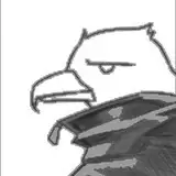
① In this case, I want to draw the viewer's attention to White Fang's face, but at this point, the grave marker in the foreground and White Fang's silhouette are so assimilated that they are difficult to see. It is also difficult to get a sense of perspective that these are separated into foreground and background.
② In the second image, the shadow is cast on White Fang to make it easier to see that he is further back than the grave marker in the foreground.
③ In ②, there was a sense that the viewer's gaze was drawn to the hair on the side rather than the face, so I made the shadow a simple shape. Now the viewer's eyes are more drawn to her face than in ②.
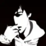
④ Almost completed. The items have been cleared, and I think this is fine as far as the color version goes. However, there was an impression of eye fatigue because of the extremely intense light and dark. If you check it with the value layer, you can easily understand the dazzling sensation of the mixture of pitch black and pure white.
⑤ To create the atmosphere and improve ④, the balance was further adjusted with gradation maps and tone curves.
This achieved all of the above and also reduced the glare, which is a burden to the eyes.