How to Inktober #2
Added 2021-10-05 12:40:39 +0000 UTCIn this article, I will introduce the making of Inktober 2021 Day 4 "KNOT".
But I'm still learning about these things, so I'm nervous about making and teaching them to everyone 😅.

🖋Contrast
Contrast refers to the difference in brightness.
This difference in brightness is the most important factor in guiding the human eye. The more the difference in brightness, the more it attracts the eye.
The figure is an example. The black silhouette on a white screen or the white silhouette on a black screen attracts the eye, doesn't it? In other words, by increasing the contrast between the subject you want to show and its surroundings, you can naturally draw the viewer's attention to the subject.
Gray serves to rank the eye and to reduce the brightness of areas that do not want to be noticed.
In my work this time, I wanted the white silhouette of the dollhouse to stand out, so I made the floor and background gray to make it difficult to see. By doing so, the viewer's gaze will go to the head, body, and chair of the dollhouse in that order.
There is also a technique called "line" for guiding the eye, but I would like to discuss this another time.
🖋Making

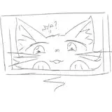
Here's an idea sketch. This time I drew a new OC, Dollhouse. I wanted the head hanging from the rope to stand out, so I increased the contrast in this area.

This time I used only a fountain pen to save time. Also, various art materials are running out of ink, so I'd like to outsource the solid black parts to digital.

I took a picture and colored the gray.