“KIGA kengen” Part , "Zenki Goki Sprite Introduction".

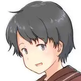
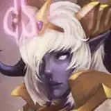
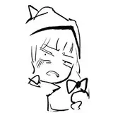
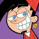
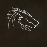
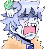
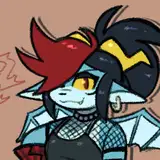
Zenki. A oni who becomes a companion at the beginning of the story.
The design concept is “the oni” and he is a red oni.

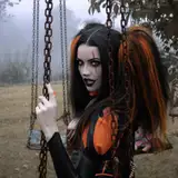
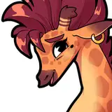
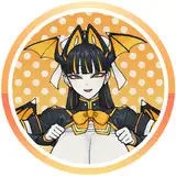
Goki. He’s the oni who joins as an ally after Zenki.
The design concept is “a handsome man from the Showa era” combined with the image of a blue oni.
Since the player characters were to consist of three members, including the protagonist Shamon, I designed Zenki and Goki as complementary characters, imagining it in a way that “the player would come to like one or the other.”
To make them appealing to as many people as possible, I shaped two types of “standards” from within myself into these designs.

Zenki was designed with a strong awareness of stereotypes.
For example: if it’s an oni, the weapon has to be a kanabō; if it’s a PE teacher, he should wear a red tracksuit; the underwear should have blue vertical stripes… I created the design by firmly matching it to the shapes that felt “just right” to me.

In contrast, Goki incorporates more design elements and distinctiveness compared to Zenki.
His weapon is a somewhat unconventional naginata, and his student-like (shosei-style) appearance reflects my personal taste.
Additionally, in this work, there’s a setting that “the more modern the oni’s appearance, the more powerful they are,” so unlike Zenki, Goki’s shosei-style look is meant to convey that immense strength.
He wears a school cap because, even in his human form, he cannot hide his broken horn.
While the scars from the break can be concealed, the horn itself cannot — resulting in a rather complex visual setup.

At the time the project was launched, here’s what the pre-remake standing illustration looked like.
I took a look at it again after a long time, and honestly, I was surprised by how rough it was 🫣
While the overall design hasn’t changed, quite a lot of the fine details have been updated.
Back then, I had this odd fixation where the oni’s clothing was considered something that “manifested,” so they were using fundoshi almost like a belt for their clothes…
In the remake, this was revised, and cords were added to the design to symbolize that Zenki and Goki are under Shamon’s command.

Also, as for Goki, his facial design was changed when the project was restarted.
This was done to clearly separate the characteristics of Zenki and Goki and because Goki’s model was set to be “a certain Showa-era silver screen icon.”

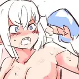
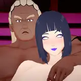
Here’s an event CG from around the time when Goki joins as an ally.
Because of system constraints, the so-called “puppet theater” approach—where pixel art characters were moved around on screen—was going to be too complex, so the plan was to gradually add event CGs like this instead.
Please look forward to the next release!
イラストの差分はDiscordサーバーにて閲覧できます。
ご参加の上ご覧ください。
You can view illustration diffs on the Discord server.
Please join us to view them.
【JPN】
鬼畫顕現その3は前鬼後鬼の立ち絵紹介とイベントCGの紹介です。
前鬼。物語の最初に仲間になる鬼です。
デザインコンセプトは「ザ・鬼」かつ、赤鬼です。
後鬼。前鬼の次に仲間になる鬼です。
デザインコンセプトは「昭和の男前」かつ、青鬼。
プレイヤーキャラクターは主人公の沙門を含めて3名ということだったので、前鬼と後鬼は対になるよう、「プレイヤーの方がどちらかを好きになるように」と想定してデザインしました。
多くの人に好きになってもらえるよう、自分の中のスタンダードを2種類形にしたデザインです。
前鬼はステレオタイプを強く意識しています。
鬼なら武器は金棒、体育教師は赤ジャージ、パンツは青の縦縞……といった具合に「自分の中でしっくりくる形」に強く当てはめたデザインにしました。
反面、後鬼は前鬼と比べてデザイン性や特異性を多めに入れています。
武器は少々変わり種の薙刀、書生風の出で立ちなのは自分の趣味です。
また今作の鬼には「出で立ちが現代的であるほど強大である」という設定があり、前鬼と違って後鬼が書生風なのはその強大さのためです。
学帽を被っているのは人間形態になった際にも折れた角は隠せないため。
折れた際の傷は隠せるものの角は隠せないという複雑なビジュアル設定になっています。
企画立ち上げ時、リメイク前の立ち絵がこちらです。
久々に見ましたが正直拙すぎてびっくりしました🫣
大枠のデザインは変わっていませんが、細かいディティールの部分は結構変わっていますね。
鬼達の服は「発生」しているので褌を服のベルトのように使用している……という妙なこだわりがこの時点ではありました。
リメイク後には改められ、前鬼後鬼が沙門の支配下にあるということを意味するような紐がデザインが加えられました。
また、後鬼に関しては企画再始動時に顔のデザインが変更されました。
前鬼と後鬼の属性をしっかり分けるという目的と、後鬼のモデルを「とある昭和の銀幕スター」に設定したためです。
こちらは後鬼仲間加入後あたりのイベントCGです。
システムの都合上ドット絵のキャラクターを画面上で動かすいわゆる「人形劇」が複雑なものであったため、こういったイベントCGを適宜追加していく予定でした。
次回の公開もお楽しみに!