Creating comics for Webtoon 2: reformatting
Added 2020-04-19 14:18:23 +0000 UTCThere are several videos on Youtube where people spend 25 minutes showing you the esoteric way they sliced up their comic to reformat it for Line Webtoon. It makes sense, I suppose, after all (as I established yesterday) there are a million teens waiting for your comics on there. Your fresh new, self-published take on superheroes, perhaps - I don't know. I can only use the tutorials as a basis.
But while this is a seductive notion, it is also wrong-headed. Underpinning the principle of the comic page is (or should be) design. The design leads the eye. Or in the case of your fresh new take on superheroes, it probably doesn't, but give it a few years.
I spent several months in 2016/7 trying to master Japanese-style 4-koma comics - the standard format for their strips - four stacked panels in half a sheet of A4. The thing I learned, very quickly, was that the roughly 3:2 panels crippled your layouts for detailed panels, because they suited tall, thin speech bubbles (obviously, as Japanese is a vertical language). You could work around it, but it was a bit painful.

Working for Webtoon requires you to learn some of the lessons of 4-koma, but you're not limited by height, so long as you can fit into the proportions of the phone screen "viewport", because you're on a (theoretically) infinite scroll. But you're still going to have to push the eye around. Instead of going left to right, stop, left to right, stop, you have to go left, right, down a bit, then be cognizant of what emerges when the user scrolls.
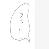
So why not just hack up an old page, move the speech bubbles around, and post it? Here's a Steeple page to illustrate my point:

I could roughly cut this page up, cropping panels, maybe sticking a couple of narrow ones side by side, then making others bigger... a bit like this... (obviously I would re-letter it, this is deliberately horrible)...

Nothing joins up. In attempting to accommodate artwork designed for the page, the connections between the characters and their environment are lost. A more sensible composition, designed for the height, would work something like this...

Clearly, I could have made some of these panels taller, or used the white space between then to lift dialogue partially or fully out of panels, because on the same size sheet of paper as I used for the original page, I now had space for that logo at the end. I have assumed, for the sake of this exercise, that you don't want to have to do any more drawing per page than a regular page takes. But hopefully this makes sense.
The only way to create proper "flow" is to design for the format. If you put any thought into line weight and composition, it's almost impossible to repurpose work for different formats. Speaking as the laziest person I know, that makes my heart very heavy.
If you have any questions, or you just want to upbraid me, let me know in the comments!
Comments
My daughter gives me webtoons from time to time to read - but now I see why I never quite liked them; I think page format is much richer
2020-07-18 00:49:39 +0000 UTCI've read quite a few on Webtoon, some more for research than enjoyment but there is so much polished work on there. The people who post there seem to have to work very hard to keep their audiences happy, a bit like Youtubers, which worries me a touch! But Lore Olympus is beautiful cartooning, no matter what format it's in - that's some god-given skill and craft.
2020-04-28 15:15:58 +0000 UTCThis is amazing and super interesting. I was barely cognisant of why some comics are so much more engaging and make so much more sense, and now I am more cognisant! Do you read comics on Line or Webtoon? I love the infinite scroll on Webtoon and how it’s used in comics like Gourmet Hound and Lore Olympus. I actually also had a similar conversation today with the artist I live with who was showing me examples of panels that aren’t well-designed and I produced some of your comics to see what he thought. I felt very validated that he approved of my reading yours 🥰😂
Jasmine
2020-04-28 06:34:47 +0000 UTC