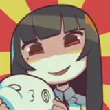
thought I'd talk a bit about how I used some references to try to capture the right atmosphere for this portrait!
in the timelapse you can see me scribble some purple in the background before I start filling it in- the commissioner gave two options for the background, either wisteria flowers or a snowy scene. I'd usually jump for a sunny wisteria background, hence trying the purple first, but I couldn't deny that this felt like a snowy drawing, so I went and found this photo from pixabay to use as a reference for the background-

I really liked the gradient from blue at the bottom to slightly more purple as you go up the mountains (though only a hint of that made it into the portrait). this pic was really helpful to get the shapes of the falling snow- I tried putting some tree branches too in but it ended up working better without.
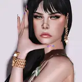
I went looking for another reference for how light would affect a subject in the snow like this. I found this picture on unsplash-

which was sooo helpful. you can see how the color of the sky reflects onto the hair, is brightest at the top and dims as the hair drops over the sides of the head- so I tried getting that down in the portrait. the fluffy white hat in the reference was coincidentally a great ref for the fluff on her dress too!