pouflon design process
Added 2024-01-25 14:54:03 +0000 UTCI wanted to show the design process of the taurus themed adopt I've been trying to work on... forever, but I've really struggled with that design and restarted it once already so I don't think I could show a coherent process for it haha. it's usually more straightforward with design commissions- I was aiming to only take pixel art commissions this month, but kendall had a custom pouflon in mind with a special personal meaning to them that I wanted to work on anyway, so I figured I would save some process shots from it instead. they wrote a bit of their own story behind the meaning of this pouf:
"I found I lost my hearing in 2022 at the age of 22. I’ve lost about 70-80% in both ears and after years of searching for an answer I was told I’ll never get one. I was told to just deal. It’s been a long journey full of challenges but found that it doesn’t define who I am! Just motivates me to work harder and be my own advocate! I was searching for a design that represented this journey and I super appreciate Ronnie taking this on for me"
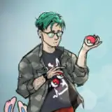
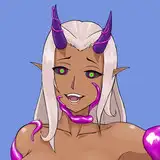
they also wanted this pouflon to represent the conflict between hope and peace vs sorrow and struggle, a few colors they had in mind, and unicorn traits including the horn and fetlocks. I looked at the last unicorn for inspiration, taking some of that style for her longer fur. I thought some draconic traits like the wings and tail could contrast the unicorn traits and help represent the theme of duality... I also intended the pose to be hopeful, rearing back in a gentle triumph, but her head turned back rather than charging ahead, kind of introspective. it's hard to come up with poses sometimes when I've worked on so many pouflons, so having a solid theme to base them around helps a lot!


going into the colors, my first impressions for the design were overall dark with a night sky feel, representing the sorrow side, and a lighter head and mane like a sunrise breaking through, representing the hope side. most of these are placeholder colors but I knew I wanted the head to be simple, cream and tan and almost monochromatic, to try to give a feeling of peace and calm.

I added some purples and blues for more of a night sky feeling- added the lighter blues at the ends of the design to try to evoke a lighter night sky there, like early morning, as if the darkest part in the middle is a transition rather than the end. but these still felt like flat placeholder colors to me, so I went looking for sky pictures to reference...

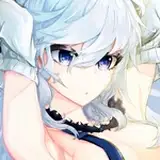
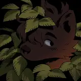
I was unexpectedly drawn to this picture I found.

I thought the dark blue/green would be a much more interesting base color so! I often switch the lineart off to check on the colors since it's easier for me to see and judge them that way.

kendall included some previous pouflon designs I'd done that they liked, and they wanted some wavy piebald markings- I was actually aiming to have these patches be like slices of a clear morning sky against the night sky more than clouds, but I couldn't quite get the shapes right and they ended up like clouds anyway. but it works either way I think haha.

cleaned up the clouds, added more stars and some edits requested by kendall!

they wanted the colors adjusted to be lighter and more pastel- I liked the dark version but I'm really into how the lighter colors turned out.


and here's the final version with the last few edits kendall wanted!