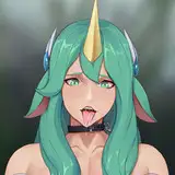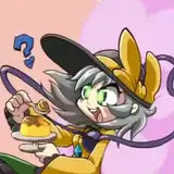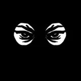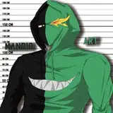
Heyyy ✨ Who wants to help me choose a thumbnail for my next video?
Let me know in the comments which one looks better: 1💗, 2💙 or 3🧡.
The text part is still subject to change, and I might even switch between thumbnails after the video is uploaded, depending on its performance... but still! I'd love to know what you think!
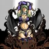
I was planning to go with the blue one at first, because of the way this background is contrasting with the character 👀 But full orange theme seems cute as well... and then there are some pink shadows on her tail that compliment this yellow/pink gradient, so... now you get why I need help, right? 😅 But which one is better for getting attention of the viewers?
Beautiful character art by sakura ani 🦊
Pixel
2023-05-09 00:31:42 +0000 UTCXion511
2023-05-08 21:58:32 +0000 UTCKrono Terra
2023-05-08 19:48:00 +0000 UTCJeremy
2023-05-08 19:17:37 +0000 UTCS
2023-05-08 18:05:59 +0000 UTCBjörn
2023-05-08 16:47:08 +0000 UTCPeter Taylor
2023-05-08 16:43:04 +0000 UTCAaron
2023-05-08 16:25:42 +0000 UTCNargles
2023-05-08 16:21:18 +0000 UTCS
2023-05-08 15:36:11 +0000 UTCS
2023-05-08 15:33:41 +0000 UTCS
2023-05-08 15:32:42 +0000 UTCtheFurret
2023-05-08 15:26:30 +0000 UTCJames Drake IX
2023-05-08 15:23:57 +0000 UTCJames Drake IX
2023-05-08 15:22:43 +0000 UTCStarscream
2023-05-08 15:20:05 +0000 UTCBleakFlameguard
2023-05-08 15:13:20 +0000 UTCDice Silvey
2023-05-08 15:12:57 +0000 UTC