I was due for a new realistic nature piece, as it's been about a year since I've paid proper tribute to my muse- the subtle beauty of the Kansas landscape. It starts with a photo reference. For these realistic pieces, I always pull from my own photos. Referencing images off the web is a great way to find inspiration and explore subjects you can't access irl. However, taking your own photos grants more creative agency, and overall authenticity. The more intimate you are with the landscape, the more authentic it tends to feel. When someone actually lives in the world they paint, somehow you can feel that in the art.
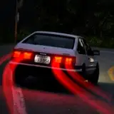
I snapped the photo just a few weeks ago on October 3rd. The reference on the right side of the slide show is cropped from the original photo, which you can see the whole photo from slide 9 onward. Note, the colors of the photos in the slideshow are reduced by the gif format and the actual reference has much more color detail. I mainly loved the colors in the sky, and also wanted to include some of the buildings in the foreground. However, the whole photo seemed a bit too wide scope to encompass in a canvas size where I can capture a fair amount of detail, yet retain a pixel art look. Furthermore, I cropped the photo to a portrait format to better capture a composition of my liking.
Through the process I made many small adjustment to proportions and spacing to further modify the composition. Most notably, I enlarged the water tower to make it a more prominent feature, and so I could give it more detail. I also pulled warm hues from the clouds that got cropped out of the photo back into the cloudscape of my composition. I experimented with including power lines and a perched bird. While it creates an interesting emotional impact, I felt the chunky lines are too disruptive to the clustering in the sky.
The general process is a lot of looking, gauging, and dropping color. I always keep my reference off to the side and develop my painting from a blank canvas, sampling colors from the photo. I pick the best common colors and blob out the entire composition before pecking out too many details. Keeping the reference separately off to the side is key, as directly tracing over the reference removes agency from clustering choices, dissuades from composition modifications, and can result in a digital art, pixelated photo look. In this case, my art has photographic quality, but I think the deliberate nature of the pixel placement is obvious, and while the color count is relatively high for me, it's quite limited in comparison to a real photograph, including 68 colors total. Furthermore, the pixel art aesthetic is sufficiently in tact.
I didn't keep close tabs on the work time, but I'd estimate about 10 hours.
128x164px
68 colors
Photoshop