As you might already know, this months challenge was photos from my latest and VERY awesome eight part series from Lisbon, Portugal with the beautiful Trine Lasson, from which you were given five free raw-files to download and play around with. 😁
The rules were simple: 'You were all given five free raw-files of mine, to process the way you felt the most'. 🤓🤌🏻🔥
So basically you were all given completely opportunities to edit just the way you wanted. 🤷🏻♂️🥳 Nothing is wrong - everything is absolutely right! 😁👏🏻
Patron J_Wilkins:

We begin with a black and white rendering of my colourful outdoor photo. 😁 I like the deep black you've achieved and at the same time you've kept the texture on her dress. Very well done - a thing way too many photographers ruins when converting to B/W if you ask me. 👏🏻
I don't know how I feel about the sky thou, but it's more on a personal level - you haven't done anything wrong, I just think it miss some of the southern late summer night vibe, you know. 😅

Your second submission is a more traditional version of my own photo. It seems to me that you've kept almost all of the original nuances and didn't go artsy on it, like the way I did. 😁
I was super close to keep it more like this, when I was at the editing, but I found it funny to do some variations in the different parts of the series - so I'm pleased to see you actually do like this way as well. ☺️👍🏻
You've raised the 'Saturation' a bit, right?

Good ol' grain! 🤤🤌🏻
I really like how you've brightened up the dark areas to gain some sort of vintage vibe to it. Super well achieved, I think. 😁
By converting to B/W and lowering the contrasts like you've done, you change to whole mood of the photo and it now looks more like something from a moodboard on Pinterest.. haha.
I LIKE IT! 🙌🏻🥳

Your last submission is a bit like the second one; It seems like you've raised the 'Saturation' and kept it more colourful and a bit more 'Cold' than I did. 😁👍🏻
I like the overall look and feel, but I do miss some sort of skin retouch on her, to smoothen out the look.
Did you by the way put in a bit green in the shadows? 😅🤷🏻♂️
Patron Stina E.:

Once again we see a submission from you, Stina, I love it. 😁🙌🏻
Thou you've only send in one photo it still counts. 😉 It seems like you've taken an opposite approach than I did myself, since my own version was toned a bit warmer and more exotic - where you have taken it in a bit darker and colder direction.
I like how it mysteries the look of it. 🤌🏻 It's hard to see thou if you have done any skin retouch and if you ask me, I would say that the window could use a bit of a touch up to make up for a more smooth look overall. ☺️
Really cool submission!
Patron Quinzin aka Dennis:

One this first photo, you've really done a good job adjusting the dark/light differences, I think. 😁🤌🏻 It was purposely chosen as it was a great challenge, due to the very low light on the original photo - but you've brightened the dark areas very well so we get so see the models beautiful curves.
It seems like you've cropped it a bit too and even fixed the window (including "renovation" the stuff outside, so it looks more smooth 😁🙌🏻). Great little detail which I personally like a lot.
All in all a superb submission, which I can't say much negative about - however, if I really should I will like to point out the use of over saturating the photo, especially the model.
She get's a bit too orange in the skin colour, which almost makes her look like a carrot with a towel on the head. 🤪🥕
I would advice you to tone down the orange/red colours just a bit, to make her look less colored. ☺️

This one is interesting! 🤓
It's pretty obvious you've blurred the background more than the original, maybe by the use of that AI feature in Lightroom you talked about?
You've removed the plan in the sky (which we, by the way, purposely planned and waited for when we did the photo.. 😂🙈) - and that makes sense because you've cropped the photo a bit more aggressive and by doing so it wouldn't make sense to have the plane in background. 👏🏻
I think it's a shame tho that you have cropped the tip of her shoes. The photo is a bit "heavy" on the right side, due to the hard cropping and the massive free space at the left side. On my original the model didn't get that massive to look at, because I included the sky above her. 😅🤷🏻♂️

This submission reminds me a bit of J Wilkins' which I showed above - but you've kept the colours a bit more natural and with a slightly lower contrast. 😁
Again, it's great to see you guys actually like this set with normal colors as well and not feel forced to stick with the more exotic or "warm" look I did. 🤓
It's been cropped a bit and it seems like you've decreased the "Structures" / "Contrasts" and you've done some very nice skin retouch too. I like that! 👏🏻 Removing the worst blemishes etc.☺️

Now THIS is interesting - especially if you compare it with the submission just above! 👀
You see, this was more or less taken the exact same spot as the photo above, however because Quinzin used some clever editing, it changes the overall mood completely - and that's what this is all about!! 🤩👏🏻
Furthermore you've cropped into a some sort of 16:9 landscape photo, instead of my vertical original. 😁 I would love to see this kind of toning on all the photos from this set, since I think it really fits the mood; It shows the beauty of the lingerie while adding some mystery to the surroundings, but still keeps the warm skin tones of the model.
Perfectly executed. 🤌🏻☺️
Patron C. Klem:

Sooooo, this is hilarious!!! 🤩🙌🏻
When I recieved your submissions, I nearly spilled all my coffee on the keyboard and laughed. 😂
FOR CLARIFICATION: I'm not making fun of C. Klems submission, because in the mail he wrote me that these are only made for fun, because he got inspired by my recent AI-photoshoot, and he laughed a bit of the results himself.. 😁🙌🏻
He wrote me;
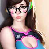
"What I did was to take your photos into an AI generator and tell it to render it with approx 70% similarity of the originals and prompted it with: "...byt as a female cyborg". 😁 I haven't done any post-process retouch afterwards, so these are totally the raw results, which make up for some good laughs. 😂"
AND I LOVE THIS !!! 😂🤌🏻 It looks equally scary and hilarious. Now enjoy the rest of his submissions below:


I mean..... 😂🤷🏻♂️
Patron PoppedEye:

The first thing that came to me when I saw these two submissions by you, PoppedEye, was that the toning reminded me of my old days. 😁 It looks very similar to the way I used to edit photos, like 5-6 years ago or so, which makes it a bit nostalgic to me. 🥹
The red-ish and brown warm tones was something I used a lot back in the day and to be honest; it really fits this particular series quite nice, so very well done, PoppedEye. ☺️👍🏻

What I just said goes as well for this submission. The red-ish tones fit it well, however a bit of skin retouch would have made it go all the way up there. 💪🏻
Interesting cropping you've used on this one by the way! 👀 Can you explain a little of why you did it this close? To intensify the fierce look of her? ☺️🤷🏻♂️
-----------------------------
Thanks for participating in this fun little game. ☺️ There will be many more in the future, so stay tuned, since the raw-files are timed exclusives for PREMIUM*. (*Afterwards they are only available for Tier 3 supporters)
To all of you who wrote me telling that you were worried of others looking at your submissions; Don't be. ☺️🖤 It's super fine to be totally new in the game and just using this as a practice to get better, due to the feedback. That's what this is all about. ☺️
NEXT CHALLENGE WILL BEGIN ON THURSDAY THE 7TH OF MARTS 2024 and consist of four photos from the official series of photos I did with Nicoline Sophie for M! Magazine + one photo from the BONUS set we later released. 😅🤓
The deadline is the 25th of Marts.
Send in your submissions to me on: mikkel.laumann@gmail.com
Now, let me know in a comment what you think about all the wonderful submissions or maybe get inspired to join for the next round! 🥳👇🏻