Before we're heading straight into August and all the epic new shoots coming your way - let's have a look at your submissions and results from the 'Edit challenge' of July announced on this post. 😁
The rules were simple: 'You were all given five free raw-files of mine, from this photoshoot to process the way you felt the most'. 🤓🤌🏻🔥
So basically you were all given completely opportunities to edit just the way you wanted. 🤷🏻♂️🥳 Nothing is wrong - everything is absolutely right! 😁👏🏻
Even thou we didn't have thaaaat many submissions or participants this month, I think you've send in some super interesting stuff and the results are of great quality this time around! 👍🏻🥳
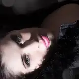
Patreon Supporter Vaupell:

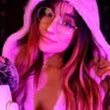
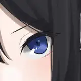
One of the first things I noticed when recieving this submission, was that the "rope / knot / thing" at the curtain, was missing.. 😂🤌🏻 I instantly knew I was gonna like this one!!
Then I looked a bit more at it and found the lamp in the background to the left, was gone too. 😉 All in all, Vaupell, has done a superb job if you ask me, in correcting minor details which fits the overall mood and calmness of the shot. 👏🏻
The warm toning and smooth skin retouch really fits it too. Great job.
I would have loved to see some more submissions from you, but you only send me this one this month, so maybe next time we will get to see some more epic stuff from you? 😉🤞🏻
-----------------------------
Patreon Supporter Trine:


For the first time (I think?) I received submissions from a supporter named Trine - and what a splendid job she did! 👏🏻🥳
Two wonderful black / white photos, turned into timeless moments.
The low contrast toning combined with a grainy look, you've added, reminds me of old analogue days. ☺️
I know nothing about your personal style or so, but I see no real skin retouch nor use of Liquify? That might be on purpose, but please let me know what your thoughts was about that part. 😁🙏🏻
All in all; two cool submissions with a fine BW toning, with no hard contrasts or any disturbance. 👍🏻
-----------------------------
Patreon Supporter Quinzin:


Okay, here we go AGAIN! 😁 Four submissions with four different looks - let's jump right down into it. 🤓👏🏻
Photo #01:
The original of this one, is rather pale and "grey". It's clear that you've maxed out or just raised the saturation a bit, on both the blue tones in the water and her skin. 😁 I never thought of this myself, and I think it looks GREAT!
I really like that water and it makes me wanna take a swim. 😂
My only issue about this photo, because you've done what you've done to it; I would have looooved to see the sky being 'maxed out' aswell. 😅 I mean, a wonderfull blue-ish sky or anything. That part is still a bit too grey, in my opinion.
Photo #02:
Okay this one is a bit interesting and I think I'm gonna need som help.. 😅🙈
It's clear that you've "inverted" it totally, meaning that it was very warmth before and now you've lowered the White Balance pretty much - but I'm curious to know why?! 😁🤷🏻♂️
It's a funny tone and I have a really hard time making a connection or a reason for the blue nuances? ☺️
Can you explain you're thoughts about that decision? 😁🤷🏻♂️
Photo #03:
I don't what you've done - but sometimes less is more. 😁🤌🏻
By cropping it a bit more like a square, you've somehow intensified it and made it look like some sort of LP cover art. hahah.
(Personally I would have removed the branch coming in in the top left corner, but fuck that for now.. 🤪😂)
I really dig this one! Great thinking, Quinzin.
Photo #04:
This one gives me 'Selective Color' vibes. A bit 90s. ☺️
Again here, you've been cropping it, but it doesn't quite work as good on this one, if you ask me. We miss out some of the photo which gives it the calmness. 😁
It's black and white, but compared with Trines submission, you aimed for a bit more contrast and depth to the vibe. That part works very well tho. 👍🏻
-----------------------------
Patreon Supporter Rass56:


Photo #01:
A very moody photo with low contrast. ☺️ You've desaturated it a bit, added in some deep red-ish colors and mystified it a bit. Somehow kinda analogue at the same time too. 😅👏🏻
I had to look a bit longer on this submission that the other one of this particular photo, because it keeps lurking my eyes somehow. Great job.
Photo #02:
All in all, this looks pretty much like my own photo, however you've somehow added some very dark blue to the shadows, am I right? 😅
It seems to me that you've played around with the curves on the green and red bar too, and added some tiny tiny vintage toning to the image. It's been cropped top and bottom too and that works very well, if you ask me. 👏🏻🥳
My only two issues on this one (and on photo #03 too by the way) is your skin retouch. In my personal opinion, it's been overdone slightly. 😅
It's a bit too obvious that the skin has been blurred and the texture is almost gone. Like its too smudgy, you know.
Final thing is; your use of liquify. 😁 It's not thaaat obvious on this particular photo - but you REALLY need to be careful when working with this tool, since it can manipulate the people too much + keep and eye out for straight lines! Always! 😅
Next time; try lowering that part a liiiiittle bit - and then you have a kick ass result! 😉💪🏻
Photo #04:
Yeah.. like I said before on photo #03; you really need to keep an eye out for lines that are straight in photos, when using liquify. 😅 (Hint: Look at the background next to her left arm)
It's super cool that you've tried and I can see that you know how to use it, to achieve a good looking person, however ALWAYS keep an eye out for the background or lines. ☺️
That being said, I really like the toning on this one. You have done a great job in keeping it calm and warm. 🙌🏻😁
-----------------------------
Thanks for participating in this fun little game. ☺️ There will be many more in the future, so stay tuned, since the raw-files are timed exclusives for PREMIUM*. (*Afterwards they are only available for Tier 3 supporters)
To all of you who wrote me telling that you were worried of others looking at your submissions; Don't be. ☺️🖤 It's super fine to be totally new in the game and just using this as a practice to get better, due to the feedback. That's what this is all about. ☺️
NEXT CHALLENGE WILL BE ANNOUNCED IN START SEPTEMBER.
Because of the summer holidays and stuff, there won't be a new challenge this August - BUT FEAR NOT: A lot of epic stuff is going on and you should really look forward to these things.. 😏🙌🏻🔥
All submissions shall be send to: mikkel.laumann@gmail.com
Now, let me know in a comment what you think about all the wonderful submissions or maybe get inspired to join for the next round! 🥳👇🏻
Mikkel Laumann
2023-08-03 19:12:51 +0000 UTCMikkel Laumann
2023-08-01 17:18:30 +0000 UTCBy Vaupell
2023-08-01 08:53:42 +0000 UTCDennis P
2023-07-28 08:56:19 +0000 UTC