XaiJu
americanmcgee
americanmcgee

patreon


A Bloody Valentine

Dear Insane Children, 

Greetings from the tropical shores of Ko Phayam in Thailand! I've just spent the last 5 days sailing up here from Chaos' home-base in Krabi. It was a beautiful journey with a nice mix of wind, waves, and excitement. We flew the new chaos symbol gennaker (that's a type of big sail you fly off the front of your boat in certain conditions) on several occasions and were amazed with how fast it pulled the boat along. Wow! 

Back in China several billion people are kicking off the start of Chinese New Year with holidays, travel, and fireworks. Year of the Dog - here we come! 

But Joey still managed to find time to draft some cover image concepts. I'd asked her to meld together Alice in both her Asylum and Wonderland forms and to place critical elements like the fire, asylum, and Wonderland in the background - trying to mirror the transformation of Alice's character and psyche. 

What image do you think works best? The Asylum background - or the split Wonderland and fire background? 

Thing is, these images are great for a poster or potential box cover - but some wires got crossed in my instructions to Joey. She was meant to render these in landscape format so that the final image could fit on the cover of the pitch PPT. Portrait won't work, but we might as well see one (or both) of these images brought to final format, yeah? 

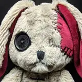
Joey also put work into creating a final version of the Caterpillar in Ice image. We'll print these and deliver them to Patrons for the month of February. Happy Valentine's Day to you all! :) 

Meanwhile tons of progress being made on Out of the Woods. Alex sent over sample images for the book layout. I think it's looking fantastic - what do you think? 

That's a little sneak peak of the actual content from the book as well. The "Take Away" section is where RJ and I riff on the moral lessons and themes contained within each tale. We had a lot of fun writing those - let us know what you think in the comments below. 

Last but not least our sponsors over at Freak Fandom just posted a new podcast where they discuss Battle Royale - "That's right, Freaks, it's time to talk about Battle Royale! We're covering the film primarily, but expect some info for the novel and manga as well. This week, we're joined by special return guest and Japanese film fan Elizabeth Baker! So remember to stay out of the danger zones, don't try to take off your collar, and may the odds be ever in your... wait... "

You can check it out on the Freaky Fandoms website! 

Alright... I have a TON of emails and work to catch up on. I'll get to you in a couple days with a video update. 

From the Shores of Paradise, 

-American 

A Bloody Valentine

Comments

Both cover image looks good. Both of them could be used for promotional poster or something around the time the game will be released. But if you are choosing one for the cover image of the proposal to EA, I will say that the one with the split Wonderland and the fire background will be better. This is only based on the draft we have here, seeing the final versions will help me formulate a better opinion. The book for Out of The Woods is looking great, can't wait to get my hands on all of the stuff.

Has anyone suggested Kristen Stewart for the Alice movie???? I know it's a little late but I was struck by a sudden inspiration when I watched a film with her in it today!! She has the green eyes and dark hair and pointed face and thin nose and pale skin!!us her attitude could be just what we need!!πŸ’œ

IMHO, it must be the asylum background. It just makes sense to me from a marketing perspective. The beautiful vistas and wondrous strangeness of wonderland, and schism symbolism can be portrayed in trailers and other marketing media, but for a product cover, I feel that it needs to be "on the nose". Just my thoughts. / I'm missing the live shows, can't wait till you're back.

truth_decay

I'm so conflicted because both images are awesome, as some people pointed out the Asylum background makes sense all things considered. Options are horrible when both options look awesome D:. Maybe like some people mentioned some elements can be worked in from one in the other. Either way they are both awesome :).

Both arts of Alice are beautiful. The second is the one I’m leaning more towards. The top sort of throws me off due to it appearing that Alice is inside of a bone shape frame.

Tori

I like the newest picture on top. Is sailing that much fun btw?

Saleh Abu-Rashid

Ooooh! I really love the bottom cover image concept! It's composed very well & flows very nicely! The rough sketch is awesome too. Has a manga-like style to it, which is totally me. I'd love to make fan art out of that sometime! Hmm... Maybe try to incorporate the asylum somehow with the bottom image too? Like maybe in the background where the black is somehow.. Kinda subtle like the checkered floor on the cover for Madness Returns. Or maybe even where the white heart-shaped borders are, it'd be cool to see them with a prison bar shape or texture or something. I don't know. It's still amazing either way. I love it. <3 Print the final, please? I buy in a heart beat. ^β€Ώ^

I like the creepiness of the asylum one, but the split wonderland one definitely grabs my attention more and is clearer. Maybe there's a way to use the concept of the bottom one but add some extra creepiness in?

I would say the Wonderland/Fire background is more appealing as the flow of the designs compliments the entire piece really well. However, I do like dark and twisted atmosphere you get from the first concept. Is there any chance of incorporating them together - maybe have the asylum one but in fire? Or make the wonderland/fire a lot darker?

The 'asylum' concept cover art I find a bit more appealing; I loved the glimpses we got at Victorian England in 'Madness Returns' and 'The Case Book of Doctor Wilson', and it would be interesting to explore more of the (horrendous) treatment of mental illness in this period.

The sail look really awesome! (: I really like the concept of the split Wonderland/fire image, but the other looks better. It's darker and looks more.. What's the word.. "Appetizing". Mysterious. It's scarier, but also inspires some curiosity and draws me in. The other is a bit more obvious, and like what you would expect, which I personally find less interesting. Enjoy paradise! Second Winter is just getting started here in Denmark.

Quite like the split wonderland idea, its much clearer. I always thought there should be a better mix between dark and lighter imagery. Gets abit dull when its all lava and metal for hours on end.

I think the split background looks too cheerful whereas the asylum background gives a darker feel

I love the asylum background, I think the dark twisting corridor displays the cryptic unknown, inviting you to want to know more. I look forward to seeing it finished and in landscape format :)

But maybe with more of an asylum theme worked in? Like the images are behind bars or something?

Definately the bottom one for me.

I really like Alice's pose in the first picture! I think its different then how she is posed in the first and second game and I think it shows a bit of vulnerability and it works because she is young but I love the second backdrop more so I think if you can takr Alice's stance and place it within the second image It could work? Tho I like the flow both images have lol so I can't decide which I like more I guess I just like aspects of bothπŸ’œ

If the asylum isn’t going to be featured as much as Wonderland in the game then I think the split background works best! Both look awesome though - any chance they could be both incorporated into the cover somehow? For example, if it were a hardcopy case, one for the front cover and one for the back?

I love both but I think the split background works well, but maybe the wonderland side should be the asylum itself, as a kind of "the fire led us to here" look, either way they both look amazing

Evibbles

I think the asylum background seems more fitting to thr Asylum game...however, I love the composition of the split background piece. Perhaps it is the flow of the shape and the pose Alice is in...I almost wonder if the asylum background could be put with those elements of the split one? Nonetheless, as usual Joey's work is wonderful! πŸ’•


More Creators