Hey guys! We had another good day on the prototype.
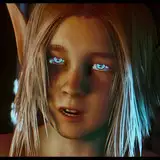
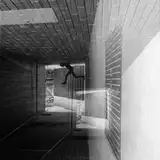
Lara has finished some test code for the Hero Headers. This UI improvement was proposed ages ago by Reila over on F95zone, her idea being that each passage has a full-width header image that conveys a sense of the location:

I've always been excited about this idea, because it reduces the wall of text aesthetic vibe the game currently has, and it gives us an extra way to engage the player with the world.
I've attached Lara's test code, which has three different Hero Headers.
Each one is rendered in three styles:
Which do you prefer?
I spent most of my time today working on the Mk II scene prototype. I nearly finished the first section, which is based on an idea of Breadloaf's: the sex scene with Max should start way before they get out onto the balcony.
Doing it this way allows us to set some flags based on player decisions rather than internal computations. This should (a) give the player more control over the direction of the scene and (b) make the whole thing easier to write – it's more straightforward for the player to tell the game that Kate is only with Max to hack his phone than it is to write every single passage so it can accommodate every possible motivation.
Moar on this on the next dev day, which is tomorrow. See you then!
hornguy6
2020-01-11 08:23:54 +0000 UTCTom Vyvey
2020-01-09 14:29:23 +0000 UTCEnrico
2020-01-09 12:50:31 +0000 UTCTarsos
2020-01-09 08:03:39 +0000 UTCChris L
2020-01-09 08:03:24 +0000 UTCCominmouse
2020-01-09 07:14:10 +0000 UTCarrgh112
2020-01-09 05:57:34 +0000 UTC