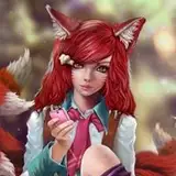
Photography edit breakdown (Itadori Yuji)
Added 2021-05-05 19:56:17 +0000 UTCHey guys! Thought I would try something a little different and make a breakdown of my process for one of my recent photo edits! Gonna be talking about the general steps I go through when making a photo manipulation edit like this!
I HIGHLY SUGGEST WATCHING THESE TUTORIALS I MADE BEFORE DIVING INTO THIS!
This one
AND
This one

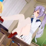
So the inspiration for the shot is the opening of the anime Jujutsu Kaisen, where Itadori is sitting on the train. So first off we need the base pose, we tried to go on an actual train for this shot but it just wasn't the right look, so we opted for this bend inside the train station and it actually gave me the perfect look I wanted to for the photo!

With that out of the way it then came time to remove myself from the image, I have covered how I do this multiple times before but its simply just the pen tool in photoshoop and tracing around my body and then copy and pasting myself out once I am done!

Here are my settings for the pen tool once I am ready to remove myself from the image, it helps to have a slight feather to the border of your edit so it looks more natural and not so clean cut.

Next was getting the perfect background, I went and purchased this stock image here after searching for a bit!

It needed a bit of editing to get the darker look I wanted to the photo so I brought down the shadows and highlights of the photo to give it that feel. I used Adobe Lightroom to do it (settings on the side) but you can use your preferred editing software for this.

Next step was removing the window background since I would be adding in my own, this took a bit of time making it transparent but I got the look I wanted! Basically I was just taking the eraser tool and going at it while also using the Select image tool and cutting out the image.

For the train background view I tried looking for a nice skyline of Japan to use and none of them felt right, I ended up just grabbing a screenshot of the original image, brightening it a bit and used that instead! I honestly really love how it looks and I think it adds a nice element to the overall photo. I also draw in the power lines from the screenshot onto the windows on the sides of the photo and color grade the tops of the windows with a blue tint to add to the look of the sky for the background.

It was then time to put myself in the photo to see how it looked, after some resizing and adjusting I got it myself where I wanted that seemed like a decent enough start!

Right now, it does not look realistic at all that I am there due to the lack of shadows, so taking a feathered brush and changing the layer to overlay, I began painting those shadows in to make the image look more together. Shadows are darkest at the focal points of the body where they meet the ground (the feet) and get lighter the further away, so I make sure to make the shadow under my legs/body fainter, I also make sure to add shadow where my hands/butt is to cover the light casted on the seat from the original shot.

Next is adding the water, were first adding our waterline, where the environment/body will meet with the water. Water has a slight reflection of light, this will also help make the water look more realistic overall.

For the water I found stock image of water and added them in layer after layer using the Overlay/Multiply layer functions to get the right look to the water.

The water was looking a little dull so I added in another layer and painted in some highlights to the water.

Since the light is being cast to the back of me it would also cast a shadow/highlight onto the water so we need to add that in as well.

Next up was adding in all the tiny details like removing the framed image on the right and replacing it with this magazine spread for Jujutsu Kaisen (theres also one o the far left on the window of the train!). I also add in a reflection of my fingers/face into the water and of course I add a fish that was seen in the opening! To get the distorted underwater look my reflection has, I use the liquify tool and just move the image from left to right till it has the right...wigglyness I want from it lol.


I really wanted to add in the glowing markings look that come from Sukuna that is shown in the opening for a split second and thankfully, there is one shot of it on a black background! This makes it so much easier to add in cause all you have to do is screenshot it, add it to a new layer and make that layer a "Luminosity layer" and you're done! I did have to slightly adjust it so it fit on my body properly though.


Now that the bulk of the editing was done it was now time to do the final touches, color grading and just making everything feel more together/cohesive. In lightroom I bring up the clarity, mess with the shadows and add in some color gradients to each side of the train to mimic the two different color lighting coming through the windows.

Last step is adding in some layers or LUTs in photoshop, which are essentially high quality instagram filters, adding these helps the color grading of the image and just make it all look nicer! I highly suggest messing with these with your own images some time!

And with that, the image is complete! I slap on my watermark and its ready to be uploaded!

As always, if you have any questions at all please let me know! I know I used a lot of different terms here but if you're confused anywhere I can try my best and answering what you're confused on! Hope you enjoyed this look at my editing process!