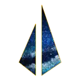
A similar process took place with the Light Cloud logo. Started with the basic shapes and colors, added stars and details.
I liked the cloud effect I did with the previous logo, so I added triangular shapes spilling out. Since this tier has the content with the first one, two rings were added to representing the first tier.
If you have any questions let me know on the comment!