*Download the uncensored video ;)
Transcription:
Hello, fellow art enthusiasts! I'd like to welcome you to a sneak peek into my studio. In this video, I'll delve into my inking process and share insights into my panel layout system. Let's dive in!
Traditional inking is no walk in the park. It demands copious practice to achieve an acceptable level, and several years to reach a professional standard. While I wouldn't label myself as a master inker, I believe I've reached a skill level sufficient for contributing to professional comics in the European comic industry. I'm content with my inking style, but naturally, I'm always striving to improve with each drawing and comic page.
I won't delve into digital inking because it's not my forte. Some artists find digital inking easier and believe it yields better results. Personally, I beg to differ. While digital lines can be 'perfect,' they often lack warmth. Even attempting long, flowing lines with a single stroke using a digital pen feels impossible to me. I've given it a try, only to conclude that my years of training in traditional inking have made it challenging for me to adapt to digital techniques. Nonetheless, there are moments when I make minor corrections using my digital program. I'm not giving up on progress.
So, what do you need to start inking? You'll want Chinese or Indian ink, a Marta Kolinsky Brush—my personal favorite is the Da Vinci Maestro Serie 10, number 3, made in Germany—a drawing nib and holder (I've been enjoying the Manga G Nib lately; it's flexible yet reliable), markers (number 1 for panel lines and 0.2 for motion lines), various rulers (especially a curve ruler, which is incredibly handy), Chinese White watercolor for corrections (avoid tempera, acrylic, or tipp-ex), and last but most crucial, the paper. I've found that Bristol paper works best with brushes and nibs.

Oh, and don't forget to have a sturdy stand for your inkpot. Do you know what's like a rite of passage for a new comic artist? That moment when the inkwell topples over onto your nearly completed page. It happened to me once when I was a beginner, but never again!
Alright, let's dive in. Why use a brush for inking? I'll demonstrate. See? With a brush, I can create a single line with varying thickness, resulting in a warm and sensual feel. I absolutely love it. It's crucial to keep only the tip of the brush wet to prolong its lifespan. During inking, I frequently rinse it in water to keep it moist while ensuring not to saturate it with excess water that could dilute the ink. Any excess ink is discharged onto a separate sheet of paper.
The majority of my work employs the brush technique. However, for short lines, it's more efficient to use the nib. Flexible drawing nibs produce both thin and thick lines in a single stroke. Nib lines may not be as soft as brush lines, or perhaps my hand isn't as steady, but imperfect lines often exude a warmth and authenticity that super-perfect lines can't match. The nib should be regularly cleaned with alcohol during the inking process.
The secret of my inking style? Loads of love and practice.
The panel layout starts in the storyboard, which is often considered the soul of a comic. While all aspects of a comic are vital, the storyboard is what truly shapes it. You can be a wonderful artist and craft fantastic stories with cool characters, but to create a comic, you must master a different and unique language: sequential art. Unlike cinema, where you have a camera, in comics, you have panels meticulously organized on a page.
The page serves as the primary unit of measurement in comics. While one might think that the panel is the key unit, it's not because a single panel does not constitute sequential art. Think of it this way: panels are like words, and the page is the sentence. Just as a single word is meaningless on its own, it's only when all the words come together in the right order that they convey the full meaning. This is a fundamental concept for any cartoonist to grasp. From there, you can group pages to complete a scene, group scenes to complete a book, but let's start with a single page.
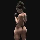
Let's dissect one of my favorite pages from Anne-Marie. What matters most to me is that a page can convey a feeling all on its own, with just a single glance, like a picture. That's my motto. In this particular page, I aimed to capture the wild femininity of Jezzy. She's deeply connected to the sea and fearlessly dives into it, much like a mermaid. Therefore, I dedicated the largest panel to Jezzy swimming.

Before that, there's a brief scene where Lad spots the ship trailing them, and Jezzy faces a critical decision. Then, she sheds her clothes and leaps from the deck. If I were to film this entire scene with a camera, I'd film the conversation between Jezzy and her crew at normal speed and the jump in slow motion to enhance its epic nature. This is what the sizable panel on the page accomplishes—it directs the reader's focus.
But I wanted to take it a step further. Why confine the beauty of my heroine within the confines of a panel? No, Jezzy represents freedom, so she breaks out of the panel's boundaries, filling the entire page as she swims toward the next one. Why, you ask? Well, why not?
That's all for now, dear patrons. I'm diligently working on the final pages of the first chapter of 'Mademoiselle D'Artagnan' and putting the finishing touches on the coloring of the first chapter of the 'Anne-Marie' series. Soon, I'll unveil the results.
Dante Remy
2024-12-05 03:36:44 +0000 UTCReina Canalla
2023-09-14 07:21:06 +0000 UTCZungur
2023-09-14 05:03:50 +0000 UTC